Crowdstreet
Client
Crowdstreet
Industry
Fintech
Disciplines
Brand Identity
Copywriting
Environmental Design
Collaborators
Brand Incite
Bureau of Betterment
Harlo
Getting Real (Estate)
In the wake of the Great Recession of 2008, Crowdstreet saw an opportunity to rethink the real estate market. They created an online platform where individual investors could get in on commercial real estate opportunities—and in the process, gave birth to commercial real estate investing for the masses. Yet, like a lot of startups, CrowdStreet was moving fast. While their visual identity was fine for the early days, it was lightyears from projecting the stability, professionalism and trustworthiness required in a financial institution like theirs.
Building from the Ground Up
The challenges of CrowdStreet’s existing identity provided an opportunity: everything was on the table. Nothing was sacred, save the name. However, jumping into visual design with no established parameters is like jumping into the middle of the Pacific for a little swim. Thankfully, the people at CrowdStreet are smart. Really smart. So, when Tess and Peter talked them through a process that was just as heavy on conceptual development as it was on visual design, they saw the promise.
One other unique challenge lay in the fact that CrowdStreet was a bifurcated brand—they had both B2B and B2C offerings. Hence, they’d need both a master brand and a visually distinct sub-brand.
Teamwork Makes Dreams Work
DAD kicked things off with brand surveys, workshops, mood boards and collaborative working sessions to help narrow the conceptual and aesthetic playing fields. The team landed on the concept of framework and substructure as a metaphor for building and construction. This, coupled with the DAD-developed “Design Lens,” led to a visual identity that brought the concept to life while holding true to CrowdStreet’s values. The tagline grew from the conceptual direction as well: “Build Wealth.”
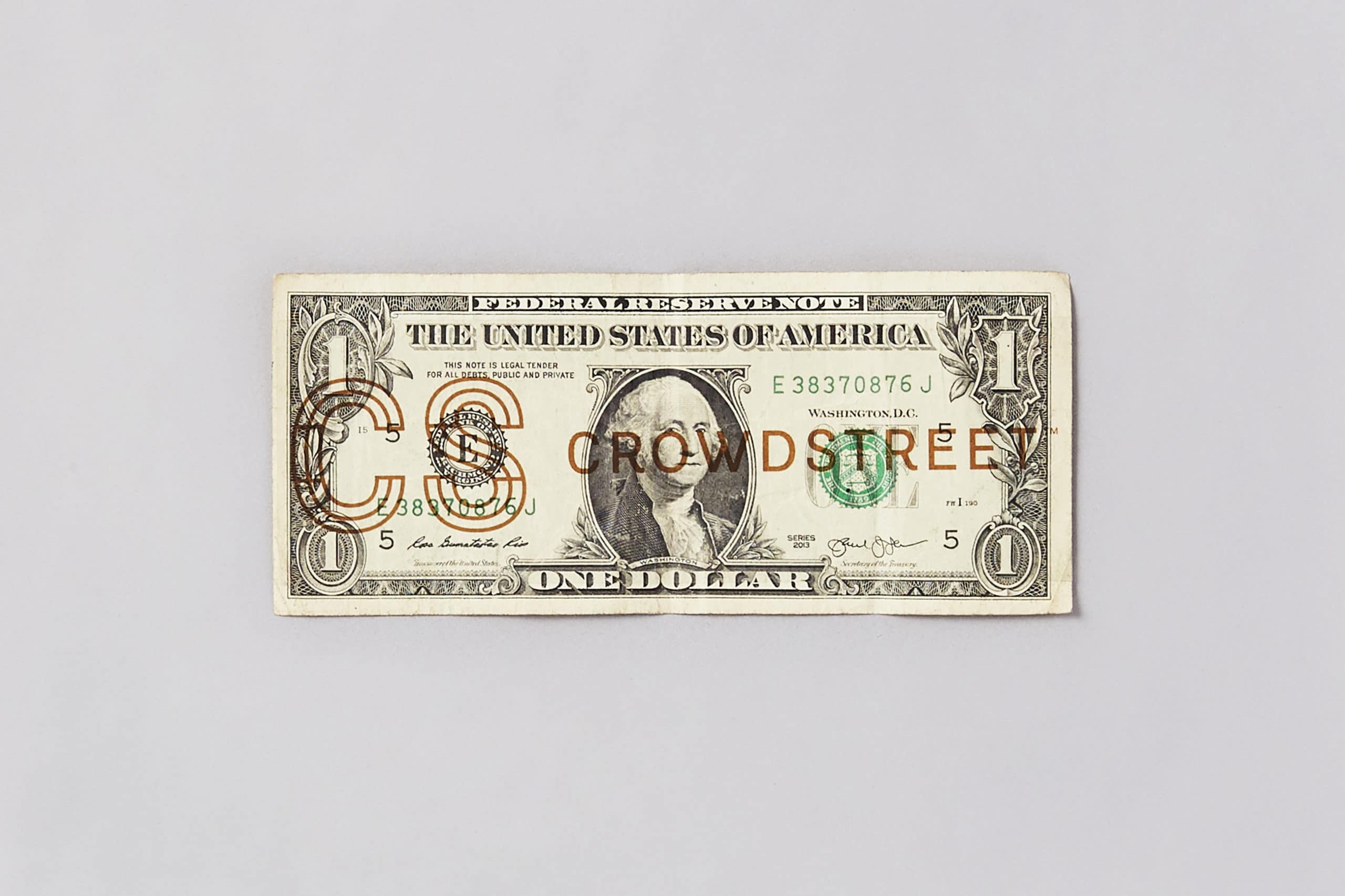
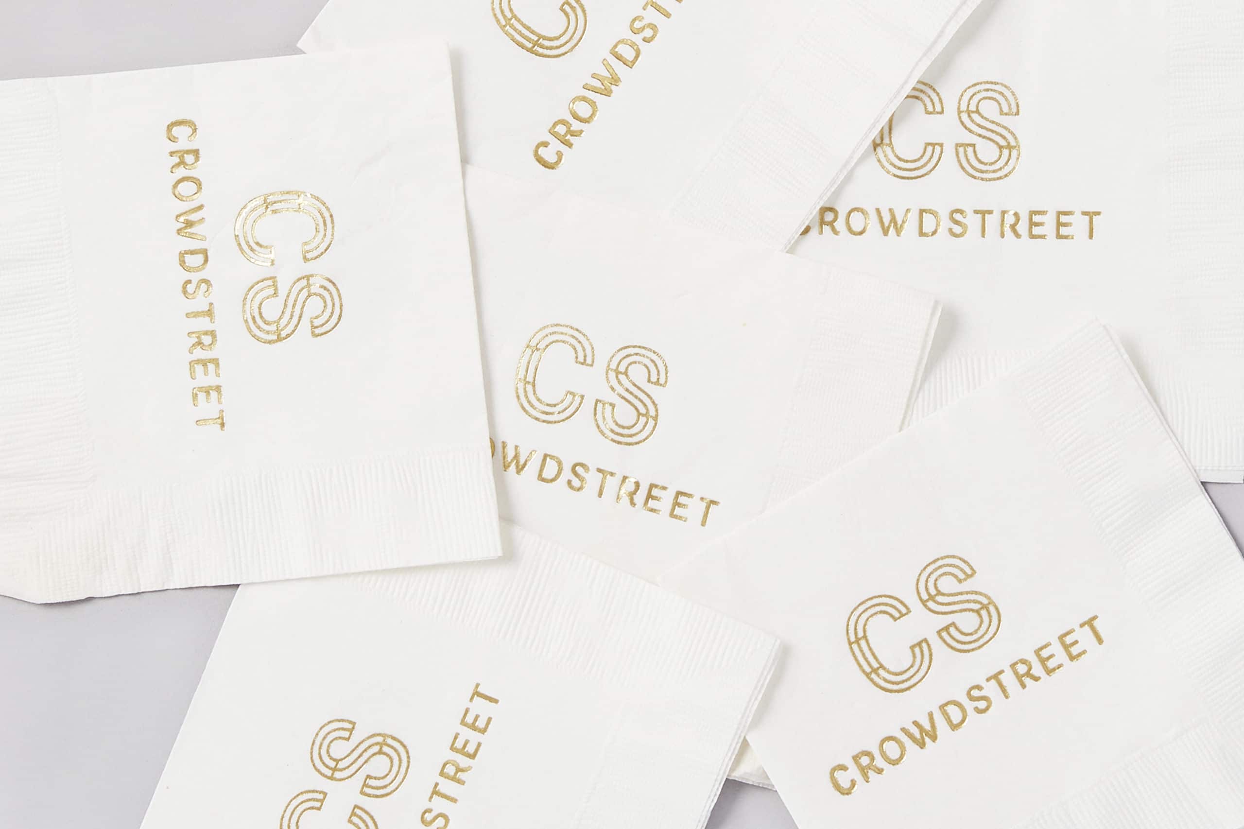
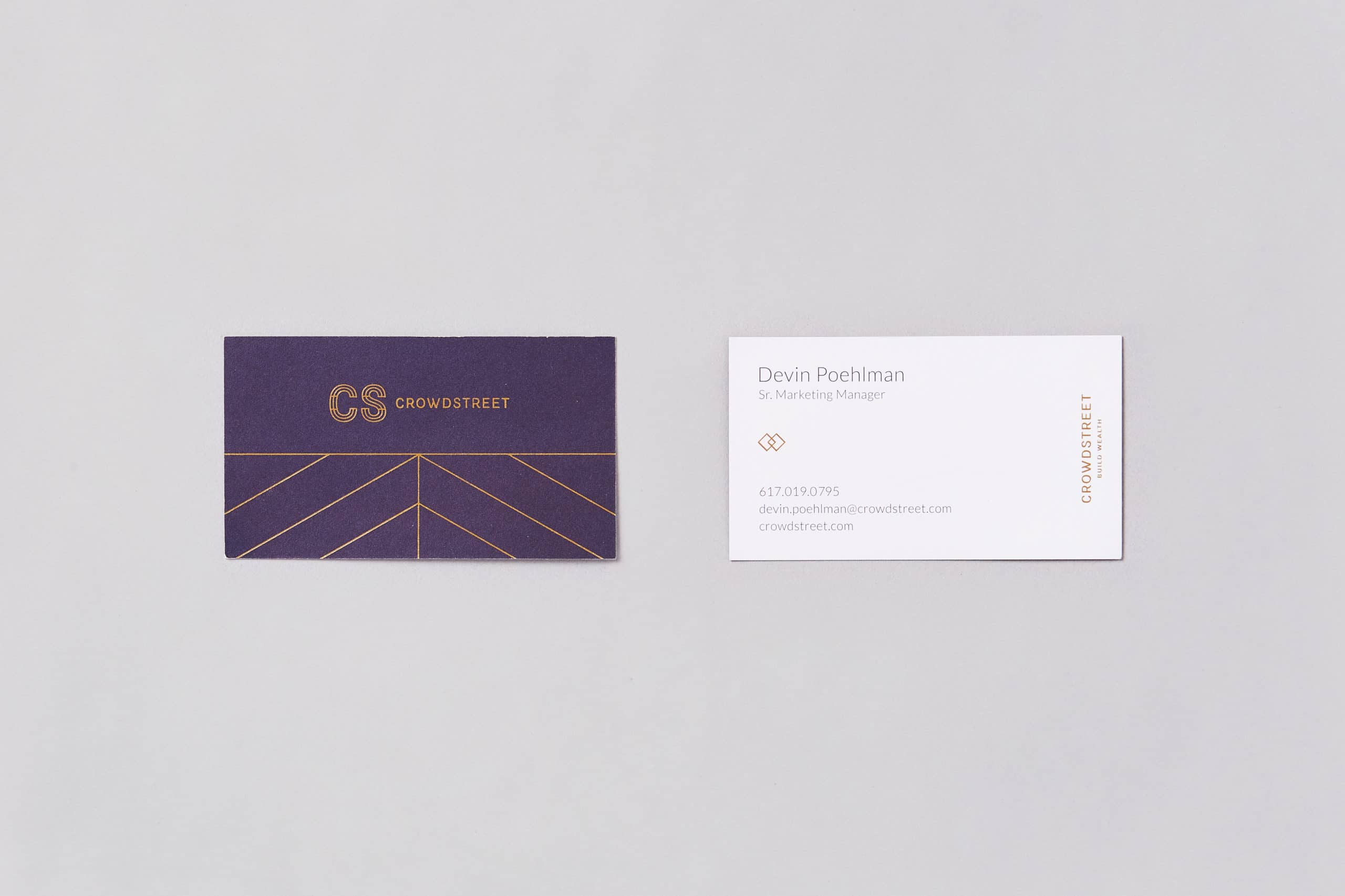
Tess and the design team created a simple, yet elegant logo mark and accompanying identity system. “Frames” became a visual theme throughout, with many secondary design elements based on the idea. To differentiate the master and sub-brand, Tess ideated two distinct flavors of the color palette.
Peter devised messaging, a brand voice and a glossary for those new to investing (like DAD), while Tess built out patterning and photo art direction. DAD then worked with CrowdStreet’s digital agency to help direct the design and build of the new website. Tess even developed environmental graphics for CrowdStreet’s new office (over the course of the project, they doubled in size). It all came together in an identity that’s as much a financial brand as it is a people brand—just like CrowdStreet.
