Ruby
Client
Ruby
Industry
Communication
Disciplines
Brand Identity
Copywriting
Photography
Video
Collaborators
Brand Incite
Bureau of Betterment
Type Five Studio
The Brigade
Half Court Studio
Sandwich
Everybody Loves Ruby
Ruby provides live virtual receptionist and chat services for small businesses across the country. You’ve probably talked to Ruby and didn’t even know it. They’re the industry leader, loved by clients and loved by each other: Ruby has a super supportive and beloved internal culture (employees refer to themselves as “Rubys”). That culture is reflected in their service. Rubys love what they do and you can hear it in every conversation they have on behalf of a client. Yet their identity system, while reflecting their uber positivity, didn’t reveal the modern, inclusive, tech-forward company Ruby had become.
Treading Lightly
Ruby’s visual brand was infused in every inch of their workspace. From common areas to nap rooms, you felt the brand as soon as you entered the office. And Rubys live the brand with conviction. So, it was going to be a challenge to keep the love alive, while changing the way everything looked. DAD had several heart-to-hearts with Ruby’s CEO to get everyone’s thinking in the same direction. Then it was time to distill the old brand’s soul into a new form of expression.
Same Ruby/New Ruby
Peter set the foundation by developing a reimagined brand narrative and messaging framework. This included a “Design Lens” for the new brand—an invaluable decision-making tool for the rest of the project. With this compass, Tess and the design team developed a visual approach. They created eight fully-fledged design directions, with Peter clocking over 100 options for Ruby’s new tagline. The work paid off with a clear winner on both fronts.
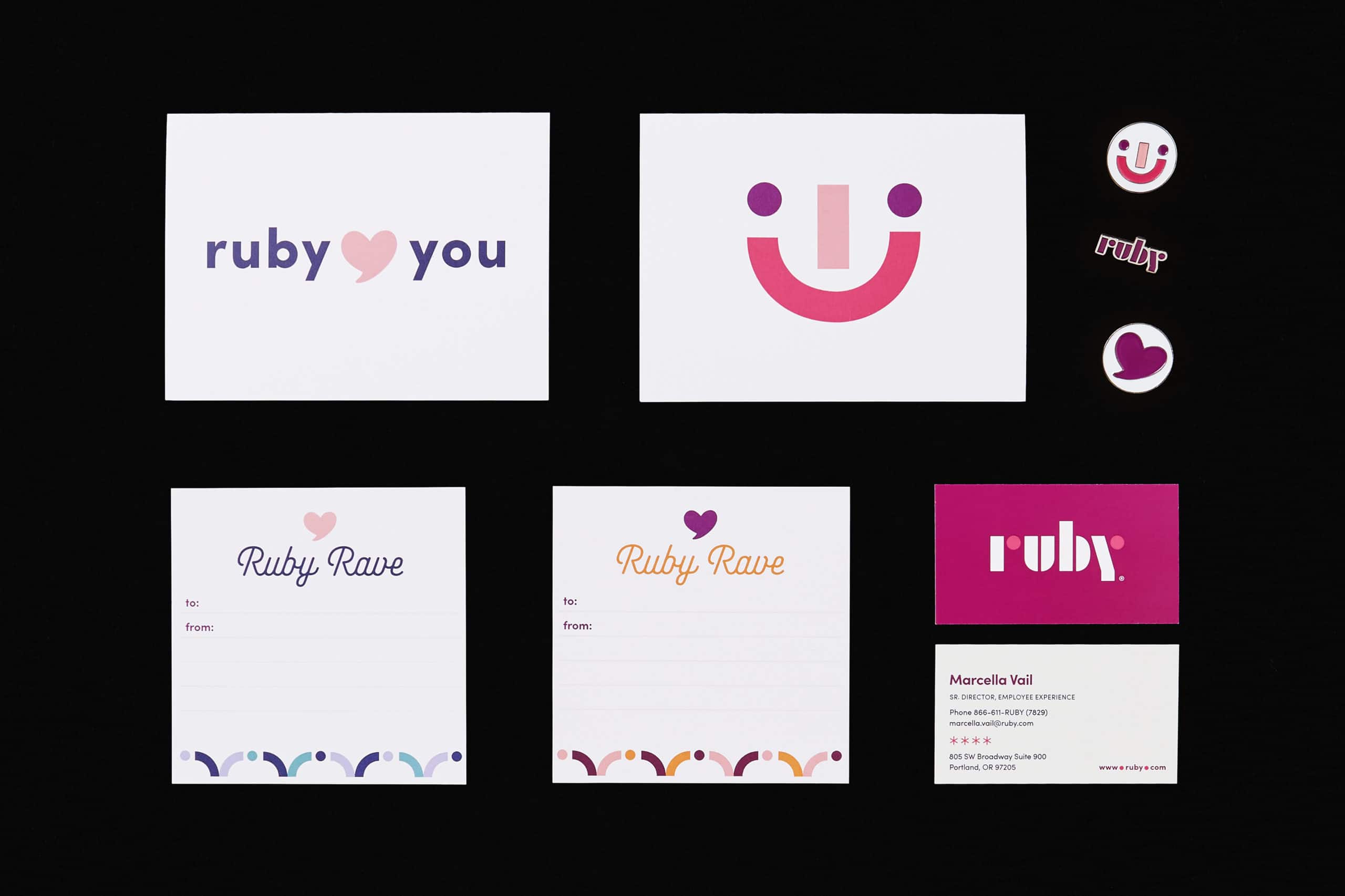
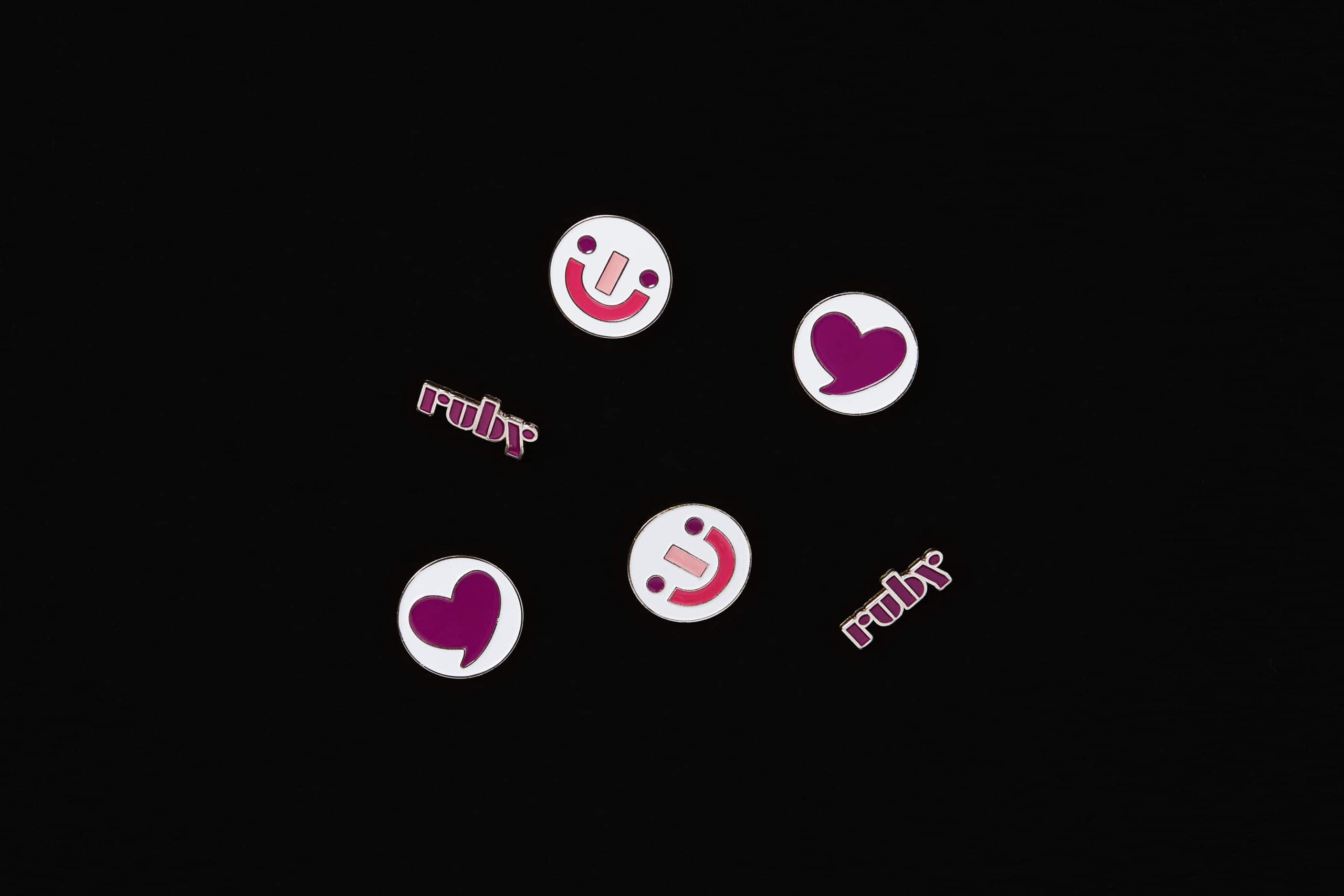
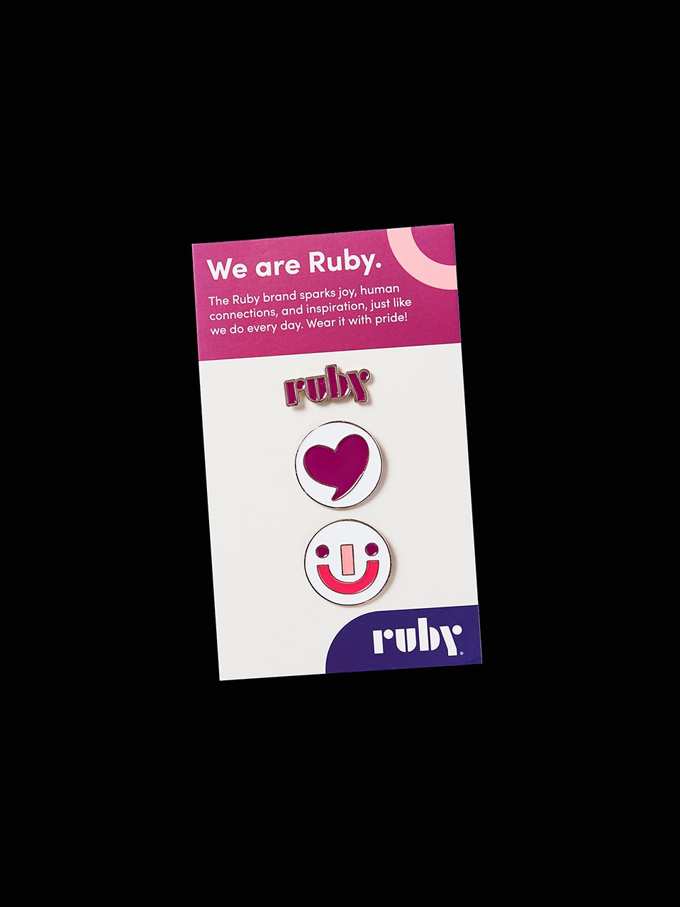
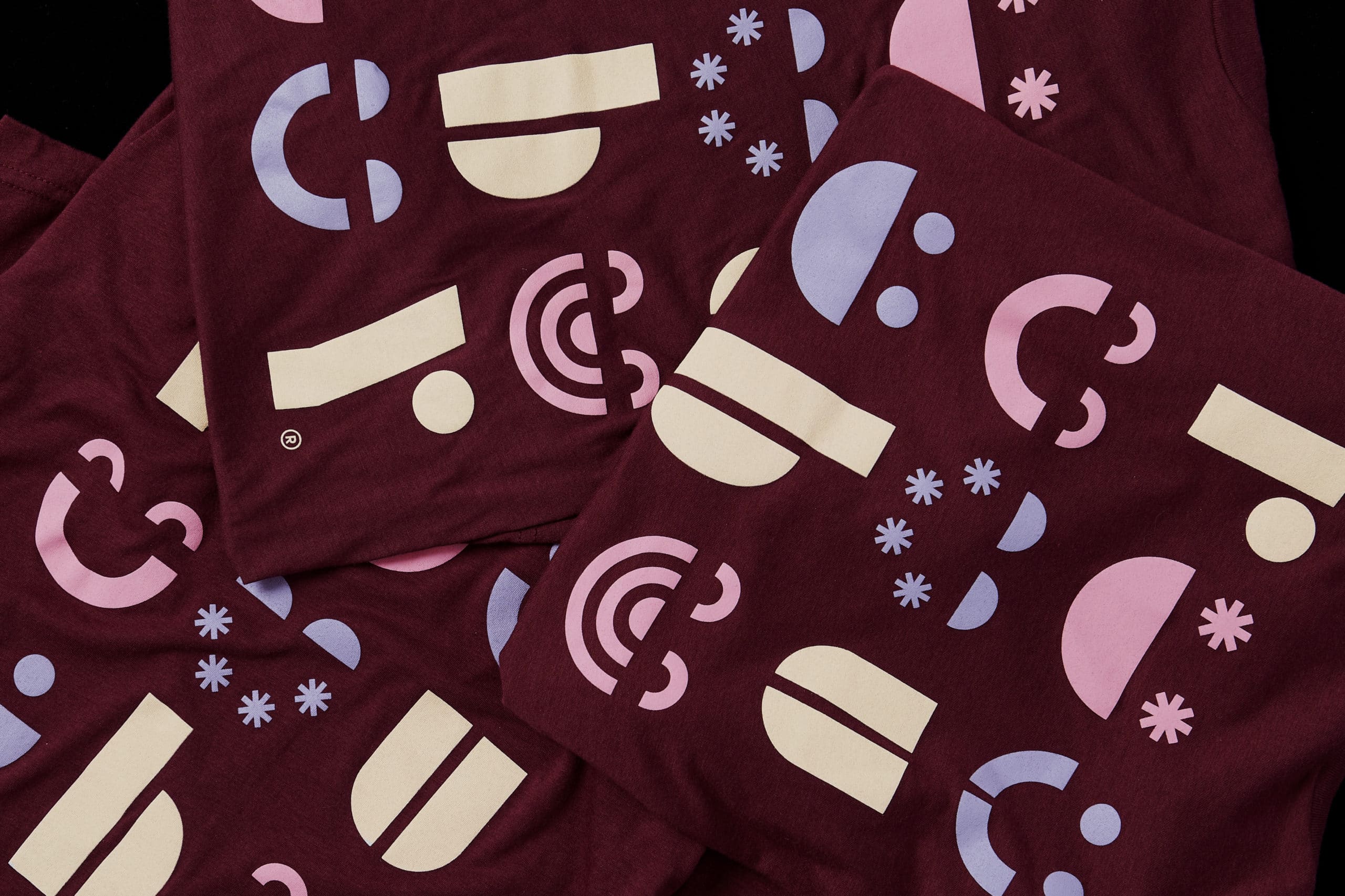
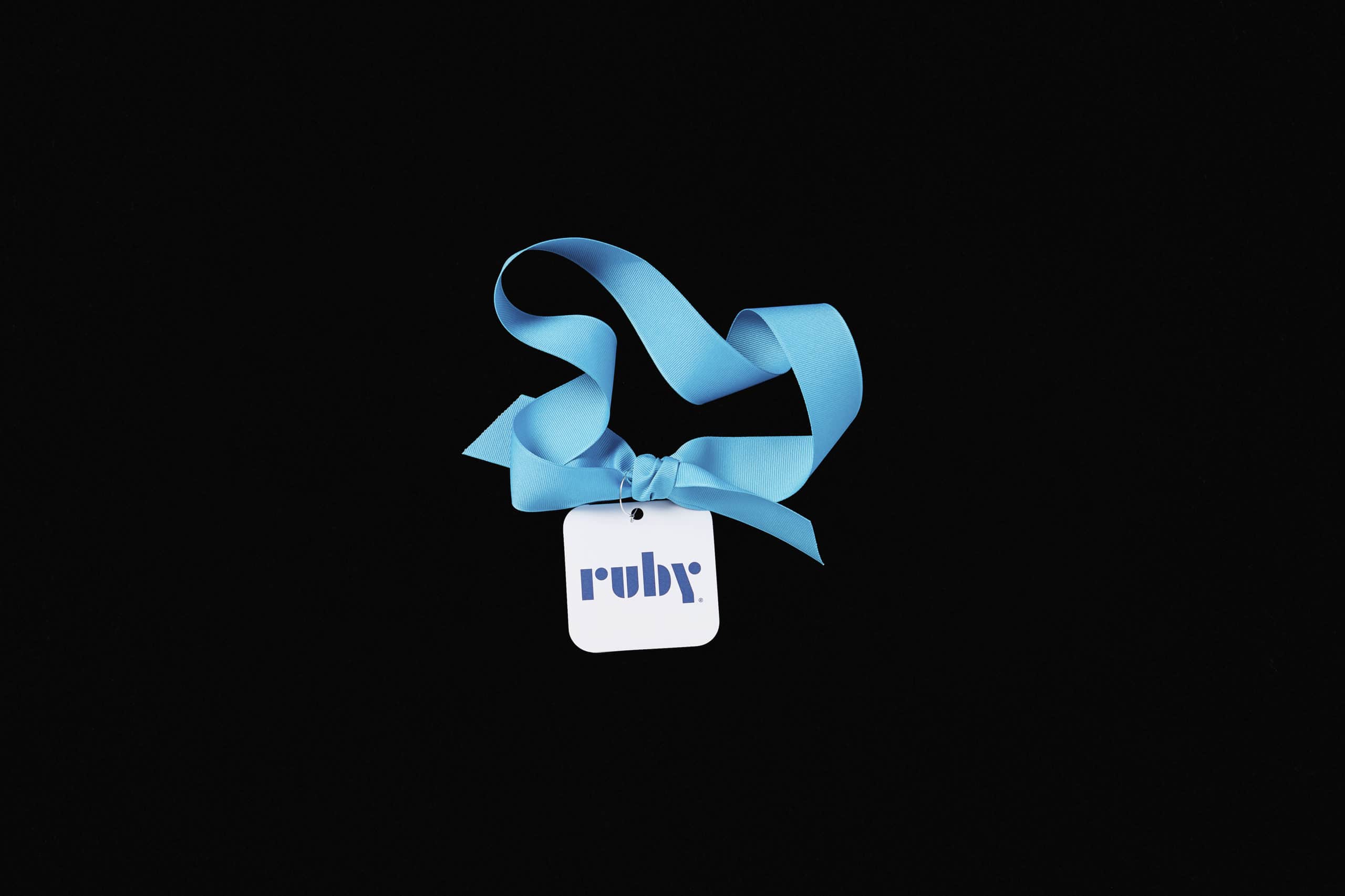
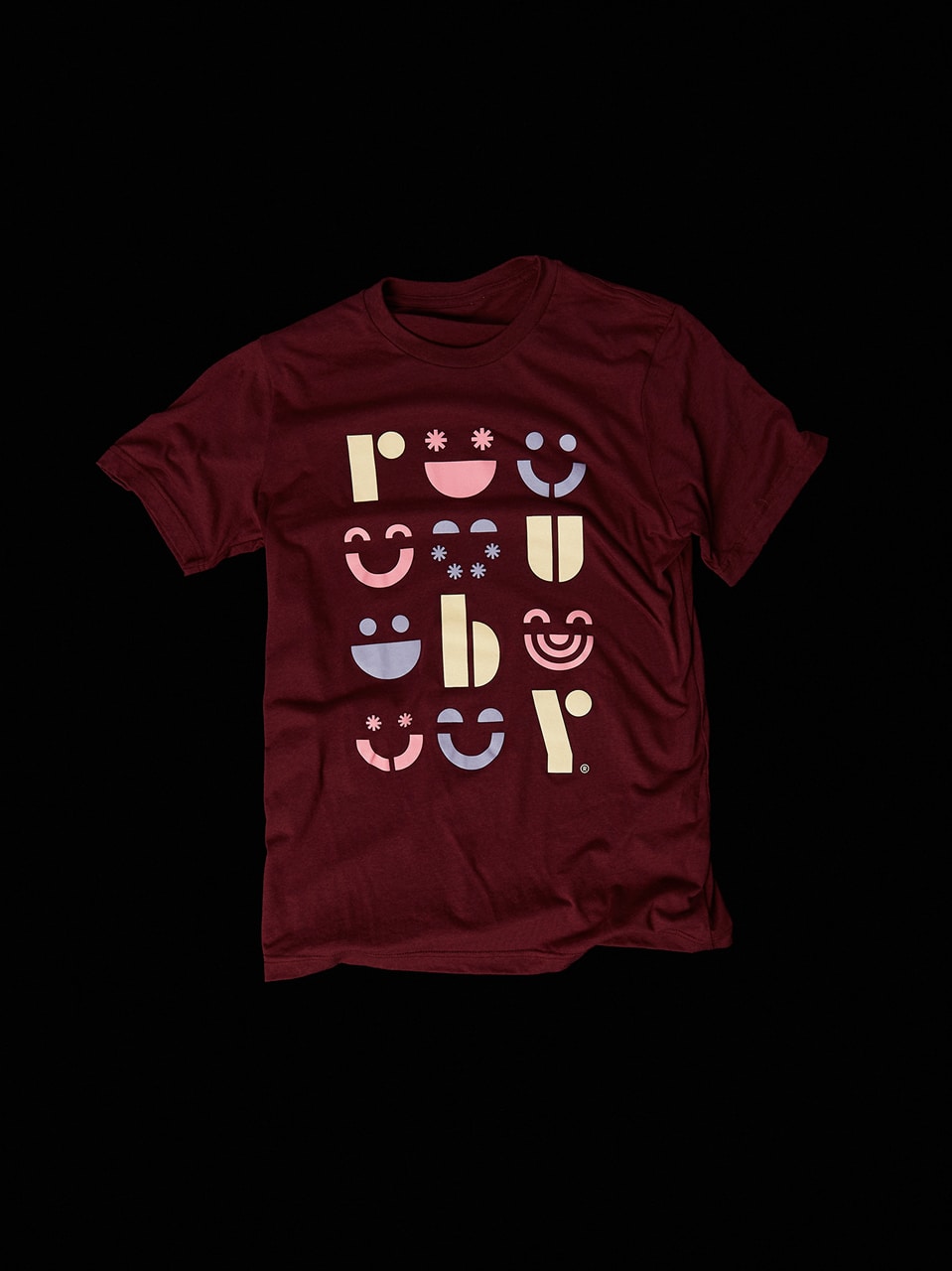
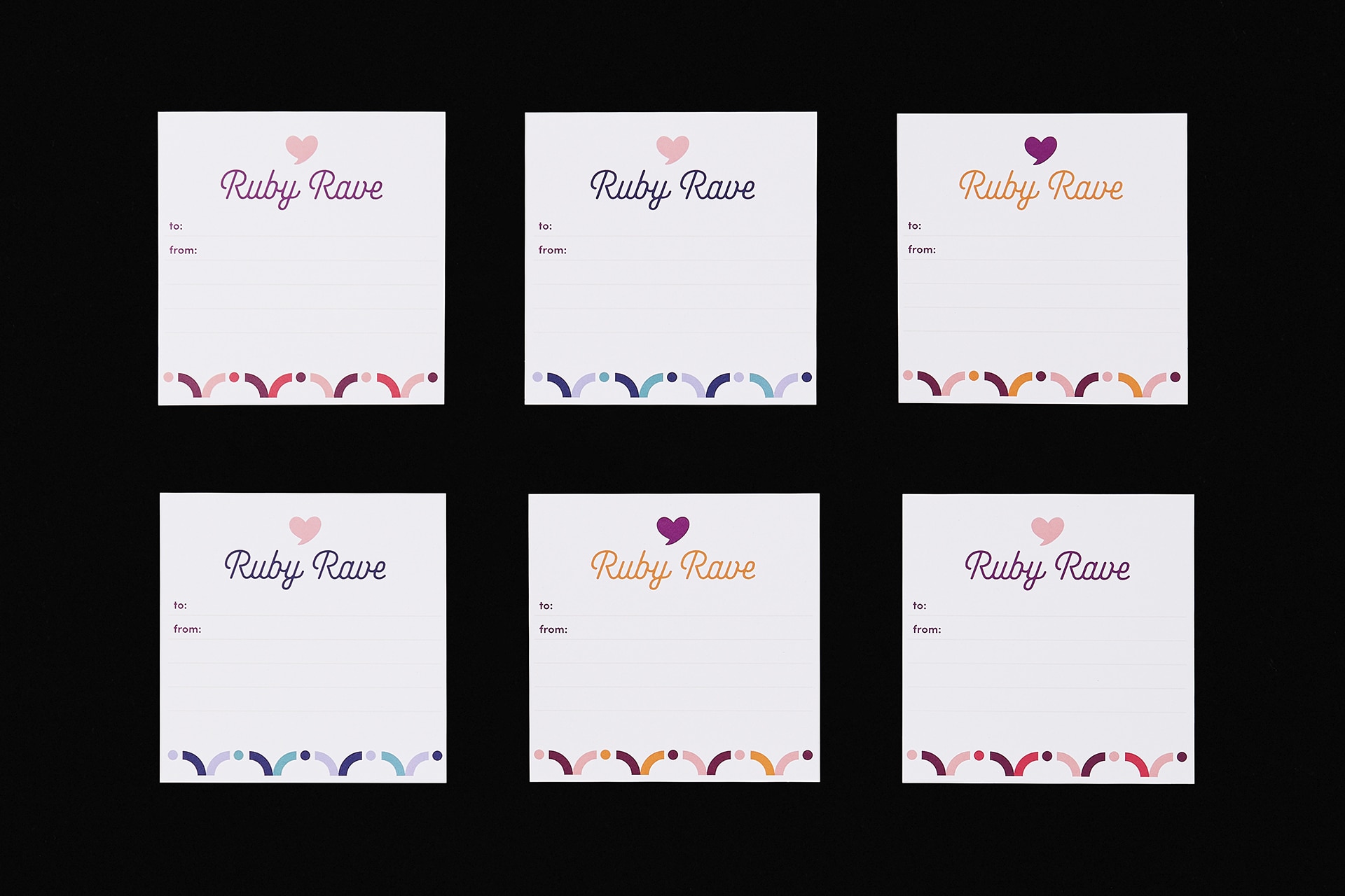
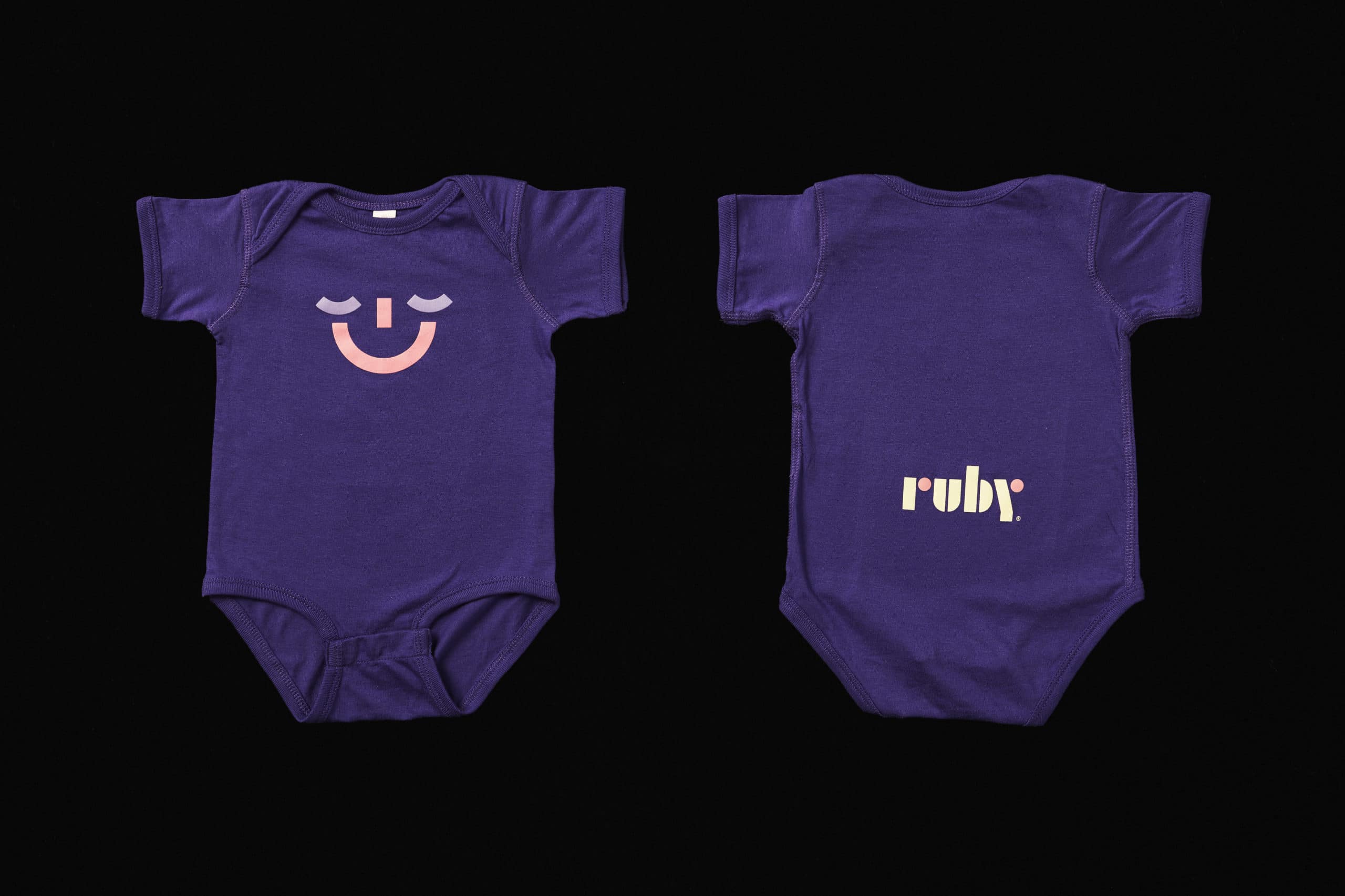
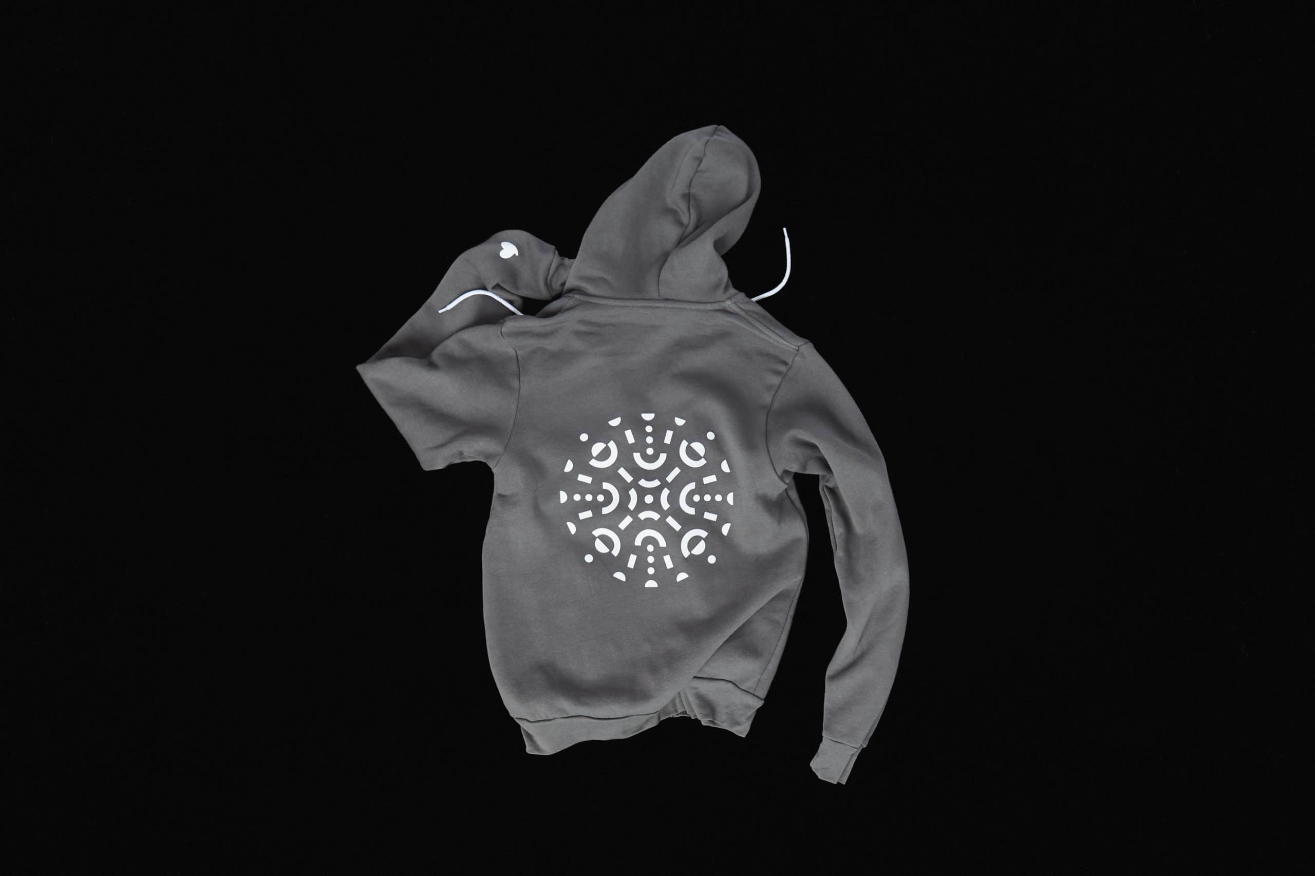
Final deliverables included a comprehensive visual identity system (including a primary and secondary logomark), a versatile color palette, a typography system, a new brand voice, stock brand messaging, an extensive library of secondary graphic elements and both photo and video art direction. Tess and Peter also oversaw the design of Ruby’s revised website and conducted a company photoshoot, showcasing several of the wonderful Rubys in Portland. As a final piece, the pair scooted down to LA to shoot Ruby’s first-ever bonafide commercial.
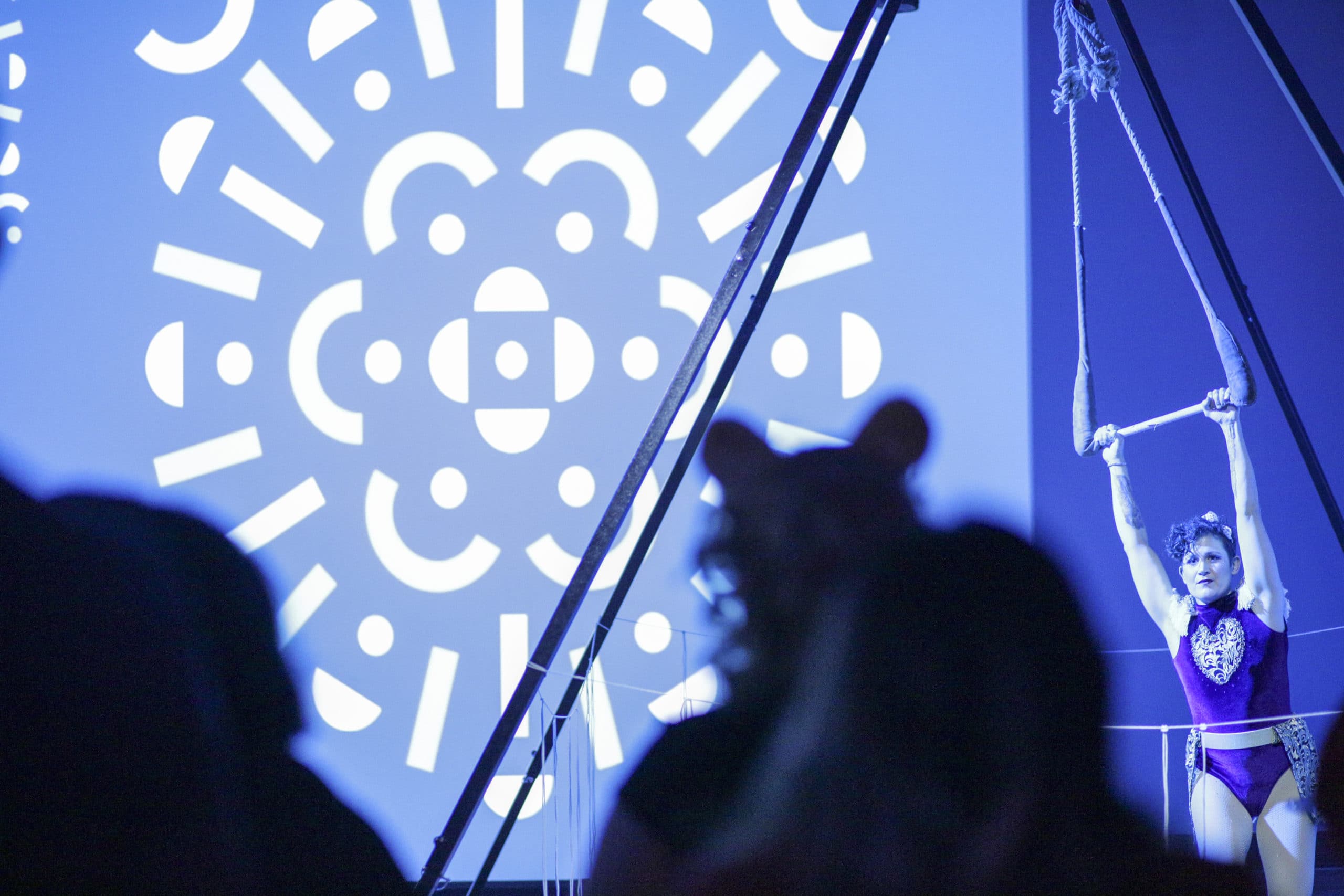
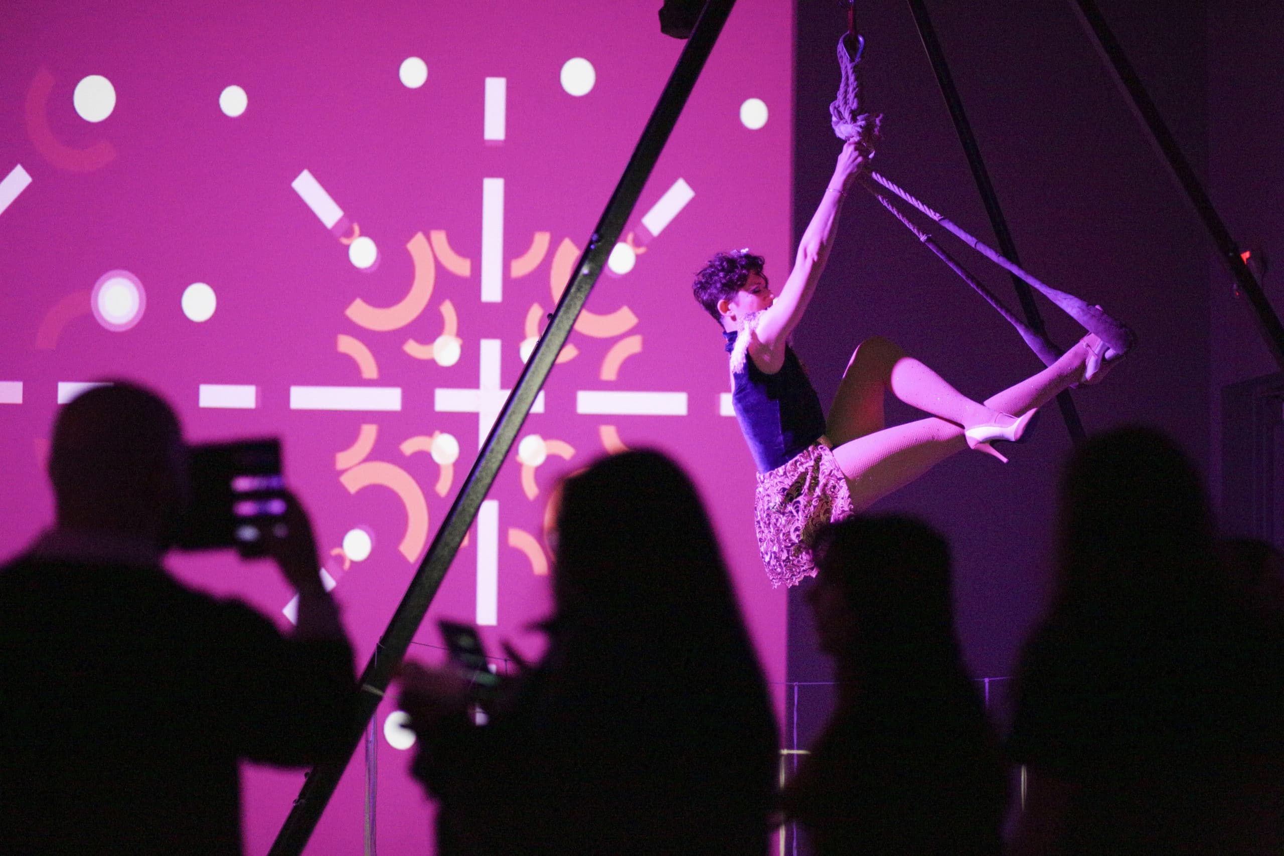
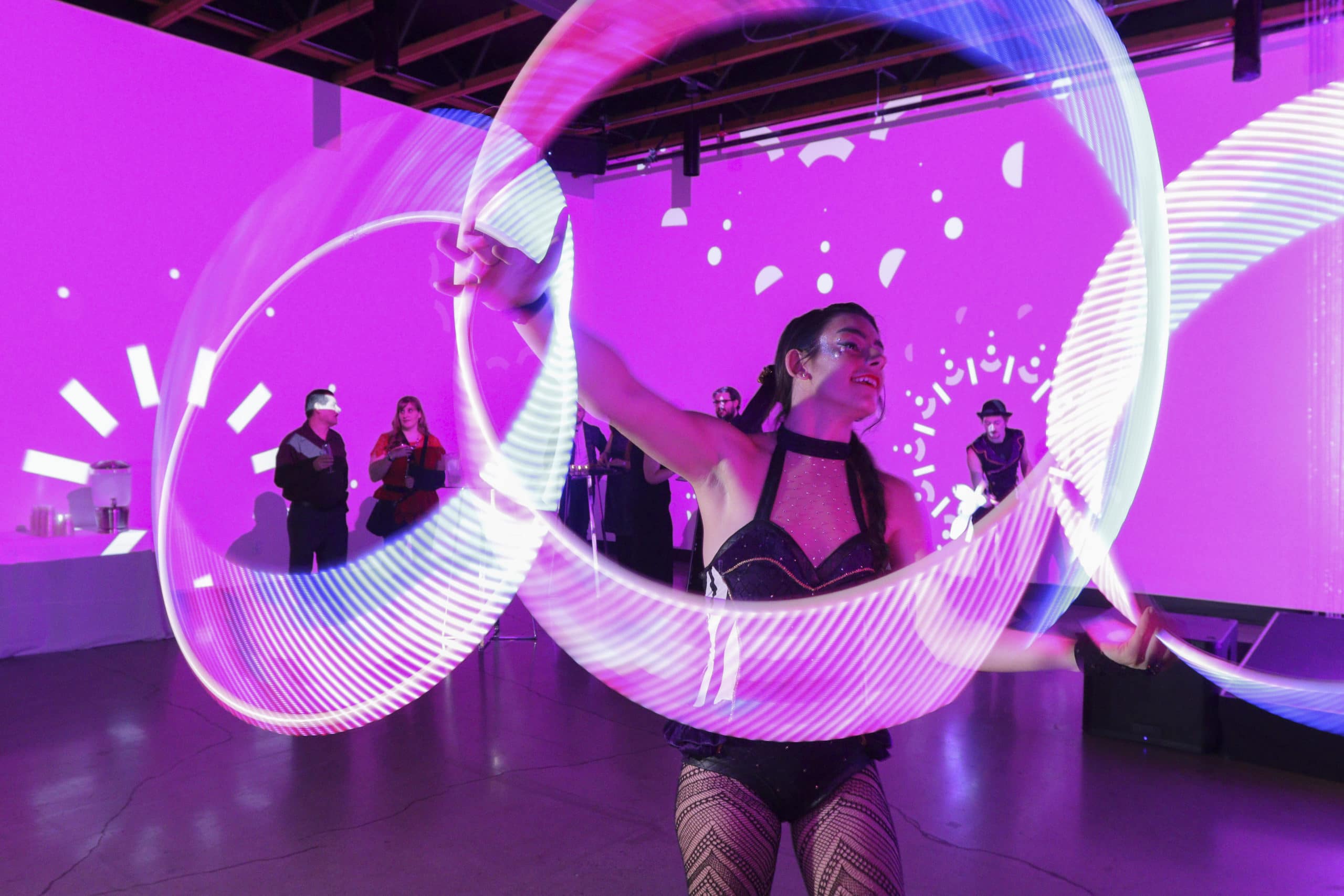
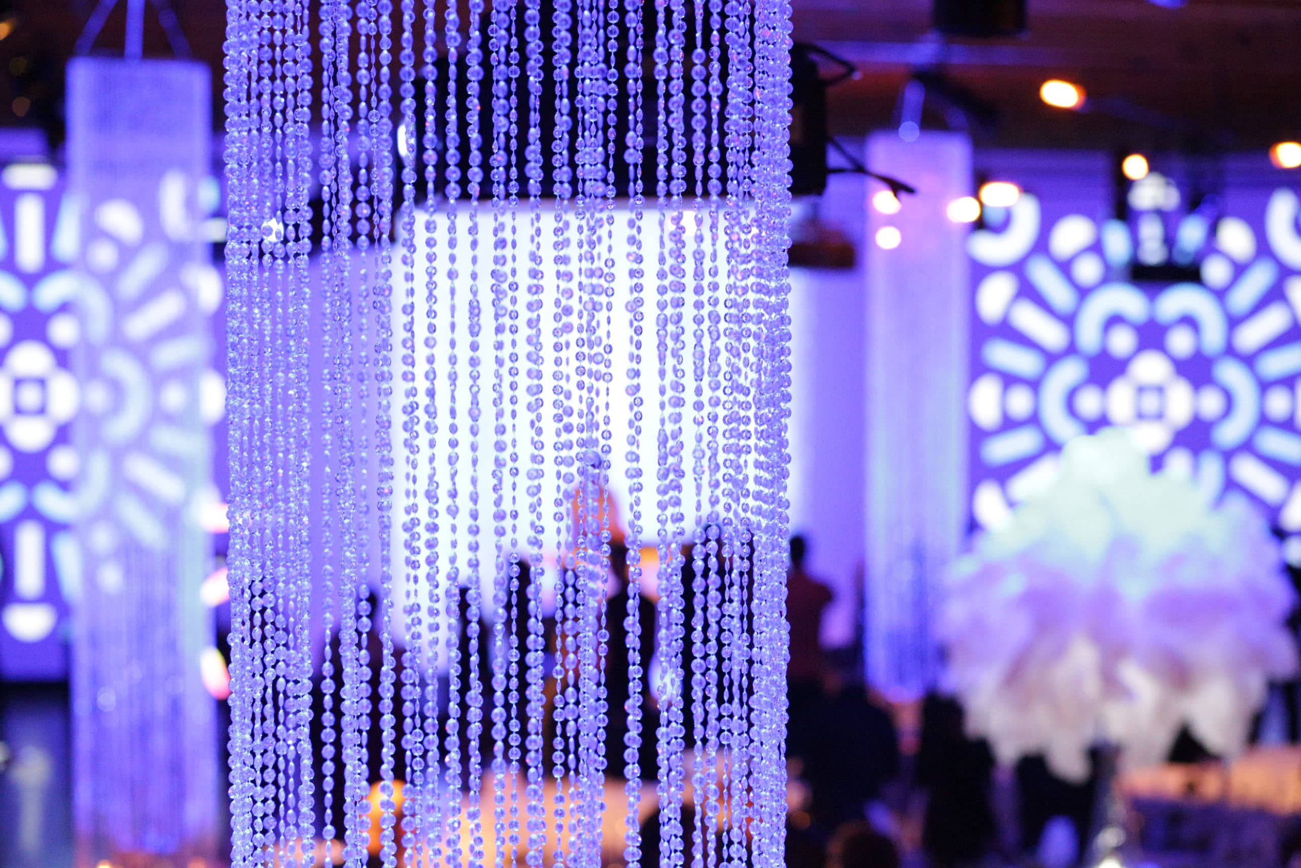
Ruby did their part, rolling out the refresh with a huge PR push and internal launch party. And the brand continues to be infused into every aspect of the company. Ruby still feels like Ruby*, only with a little glow-up.
*the excessive use of the term “Ruby” was intentional.
