MTS
Client
Med Tech Solutions
Industry
Healthcare Technology
Disciplines
Brand Design
Art Direction
Copywriting
Animation
Collaborators
Brand Incite
Type Five Studio
Deep Sky
All About The People
Med Tech Solutions (MTS) is a healthcare technology company with a unique perspective. They focus all of their services around the same model that leading-edge healthcare providers use. While providers deliver Patient-Centered Care, MTS provides Practice-Centered Care: a way to deliver solutions in a manner that caters to the individual needs of each provider. In other words, they care about the people they work for, and it shows.
De-Generic-ifying
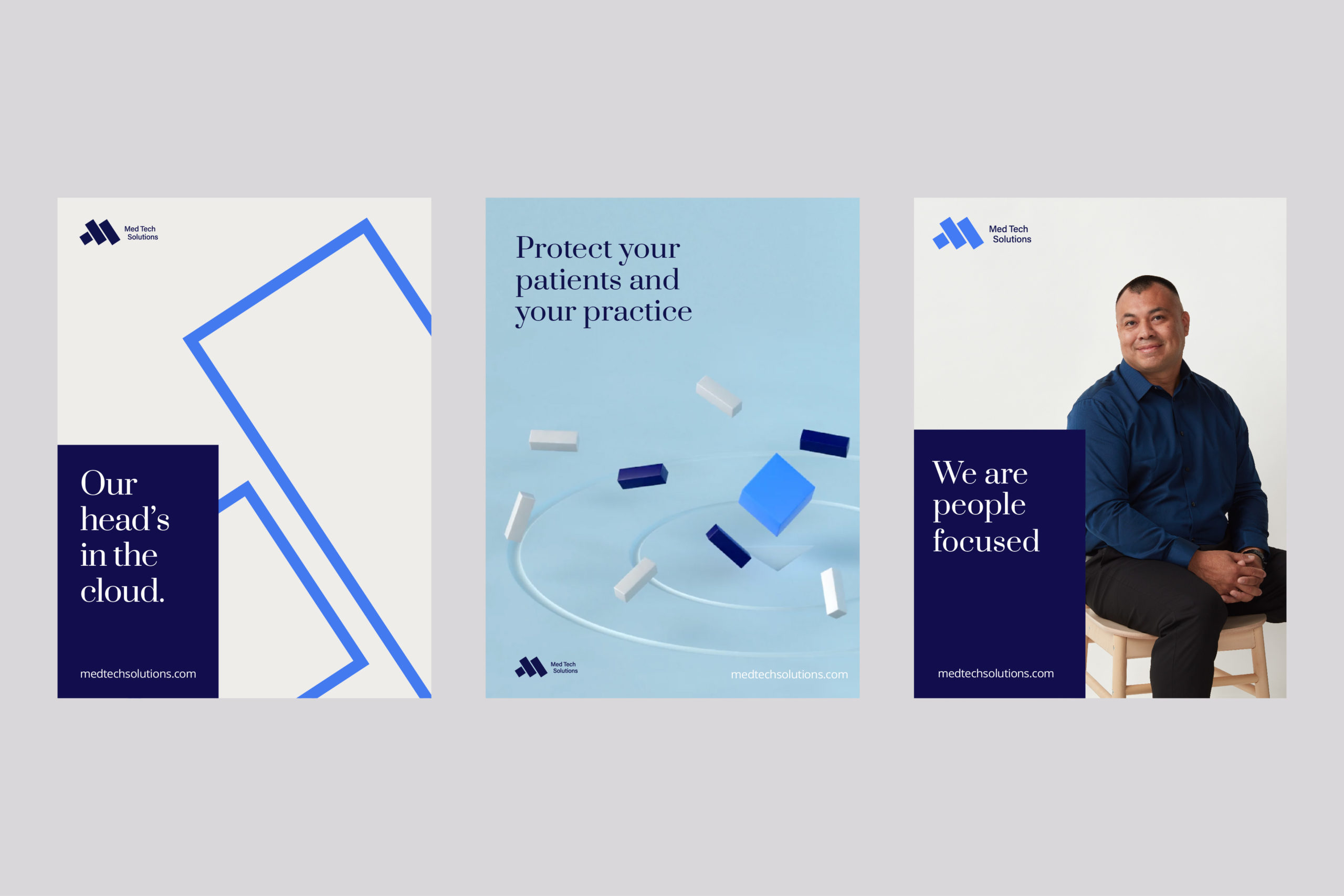
As the company neared 15 years in business, they realized that their identity system didn’t reflect their trajectory as a company, or much else really. We heard the word “generic” a lot when the people at MTS talked about their own identity. So the task seemed obvious: create a totally new identity system that reflected the company accurately and set them apart as leaders in their field (which they are).
33 Forever
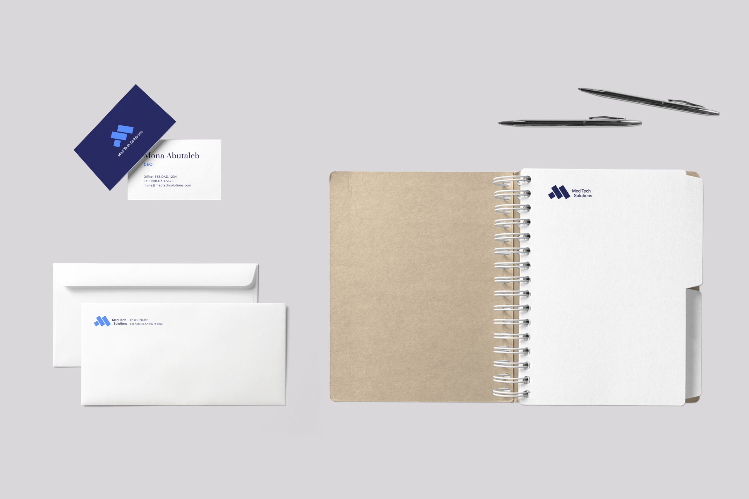
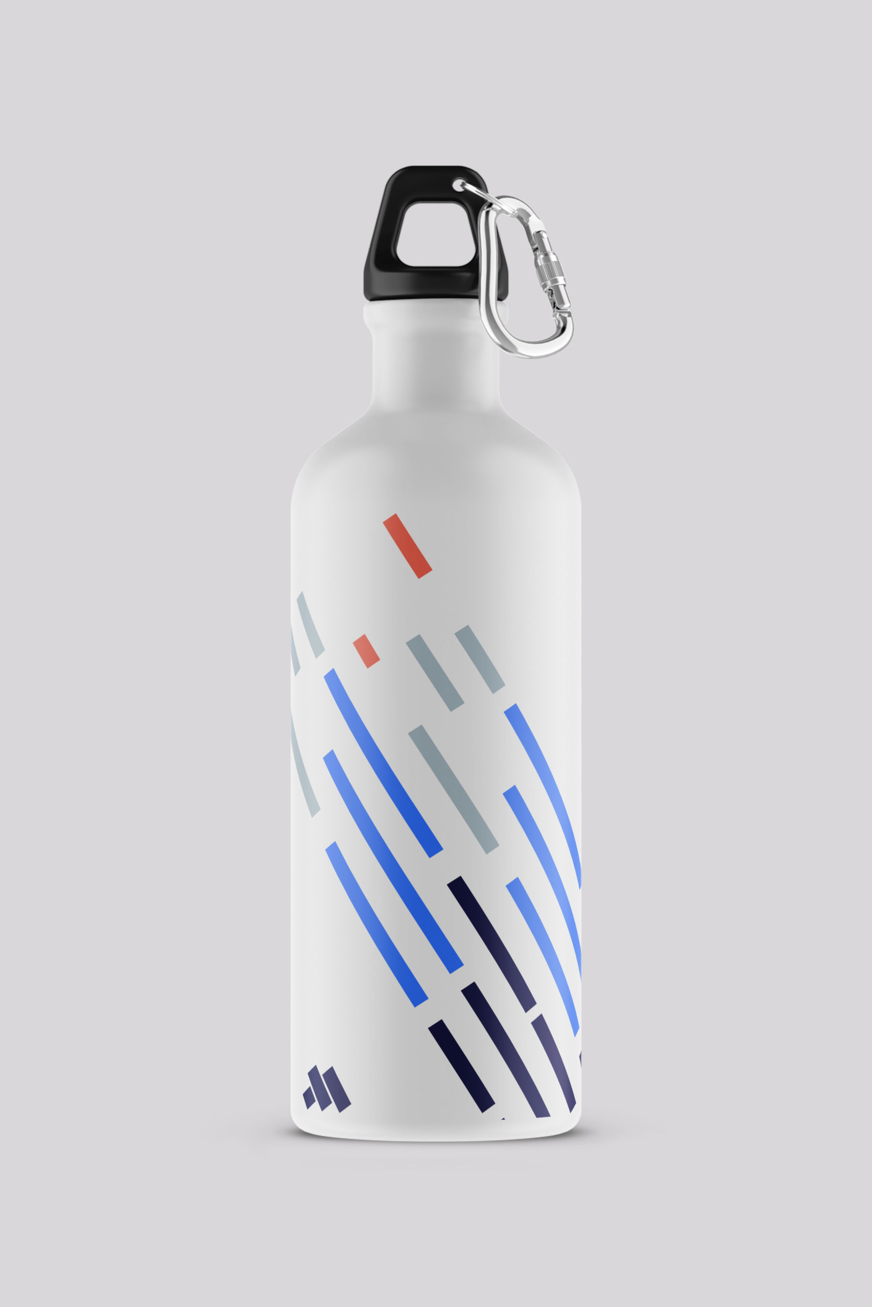
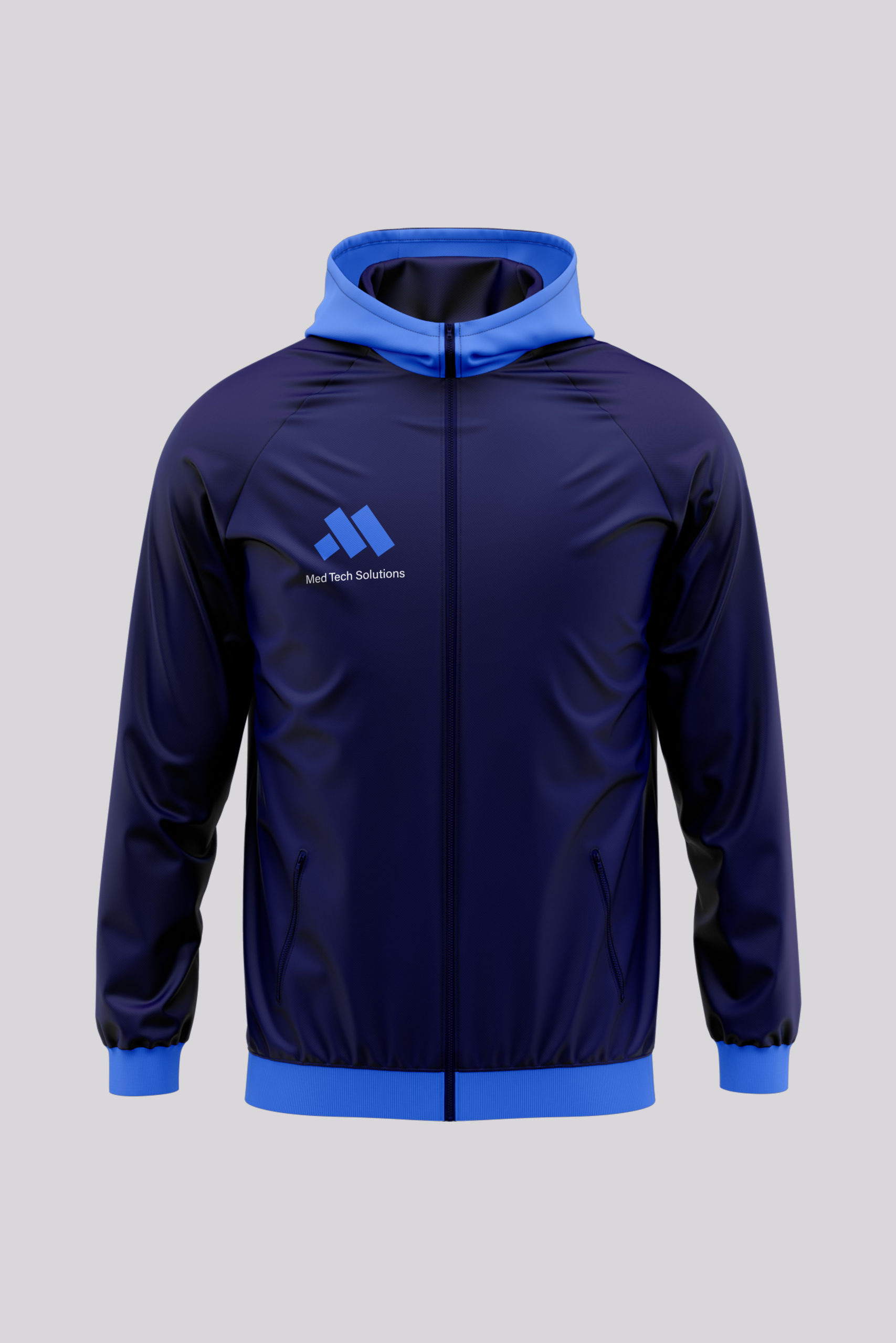
DAD worked with a collaborative team of strategists, writers and developers to build a new brand strategy, identity and digital presence. Tess worked to design a simple, but strong mark that would stand out in a large sea of competitors. The magic number that brought it all together? 33°. That’s the angle around which the mark was built, as well as the rest of the identity system. DAD commissioned 3D animations of many design elements to be used on MTS’ website and elsewhere. Tess and Peter even got in a little California sun when they jetsetted down to LA for a photo shoot of MTS employees, customers and more. The final package was at 33% better than MTS’ previous identity.


