Oregon Zoo
Client
Oregon Zoo
Industry
Conservation
Museums, Zoos & Parks
Disciplines
Brand Identity
Art Direction
Copywriting
Illustration
Animation
Video
Music Composition
Sound Design
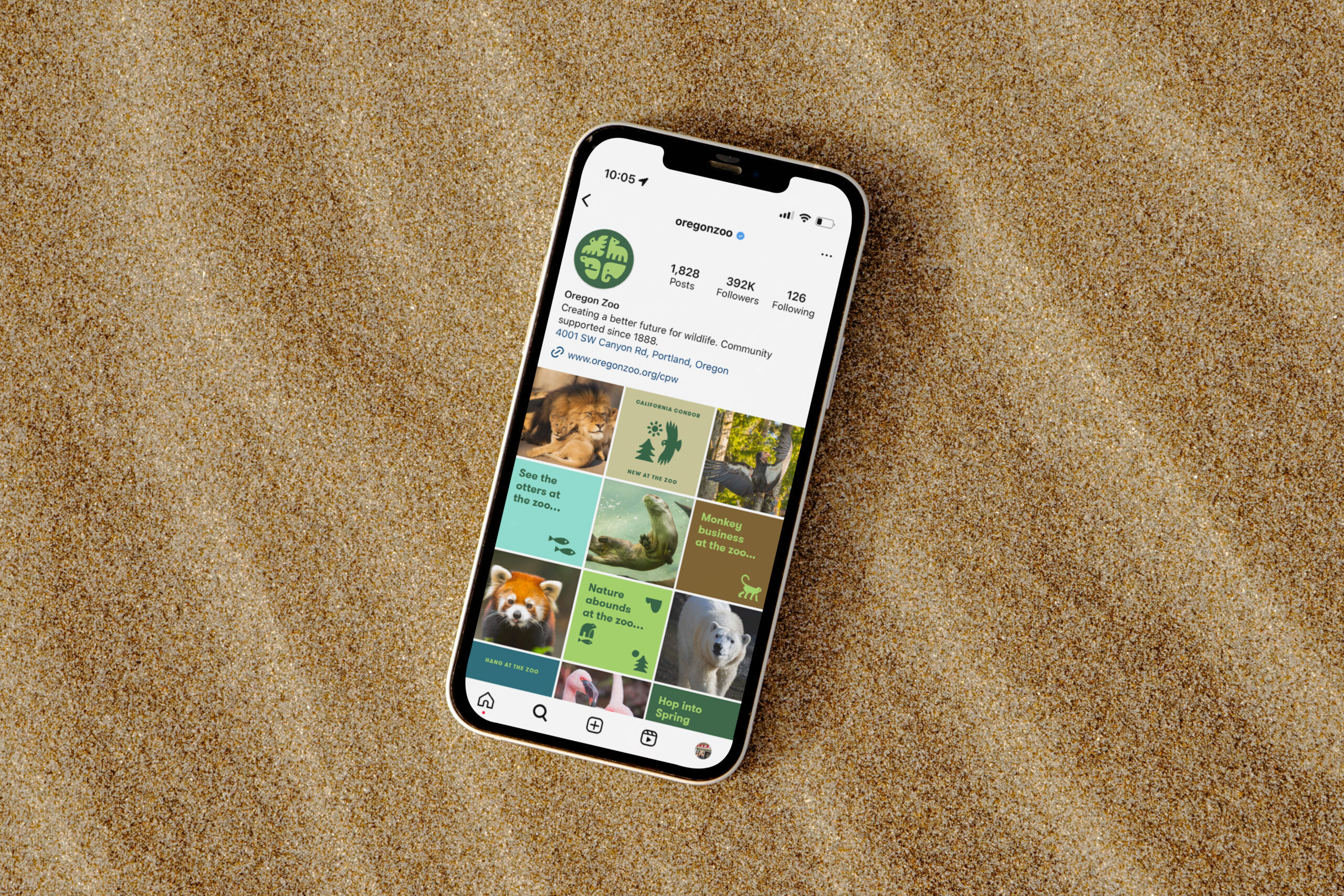
Social Content
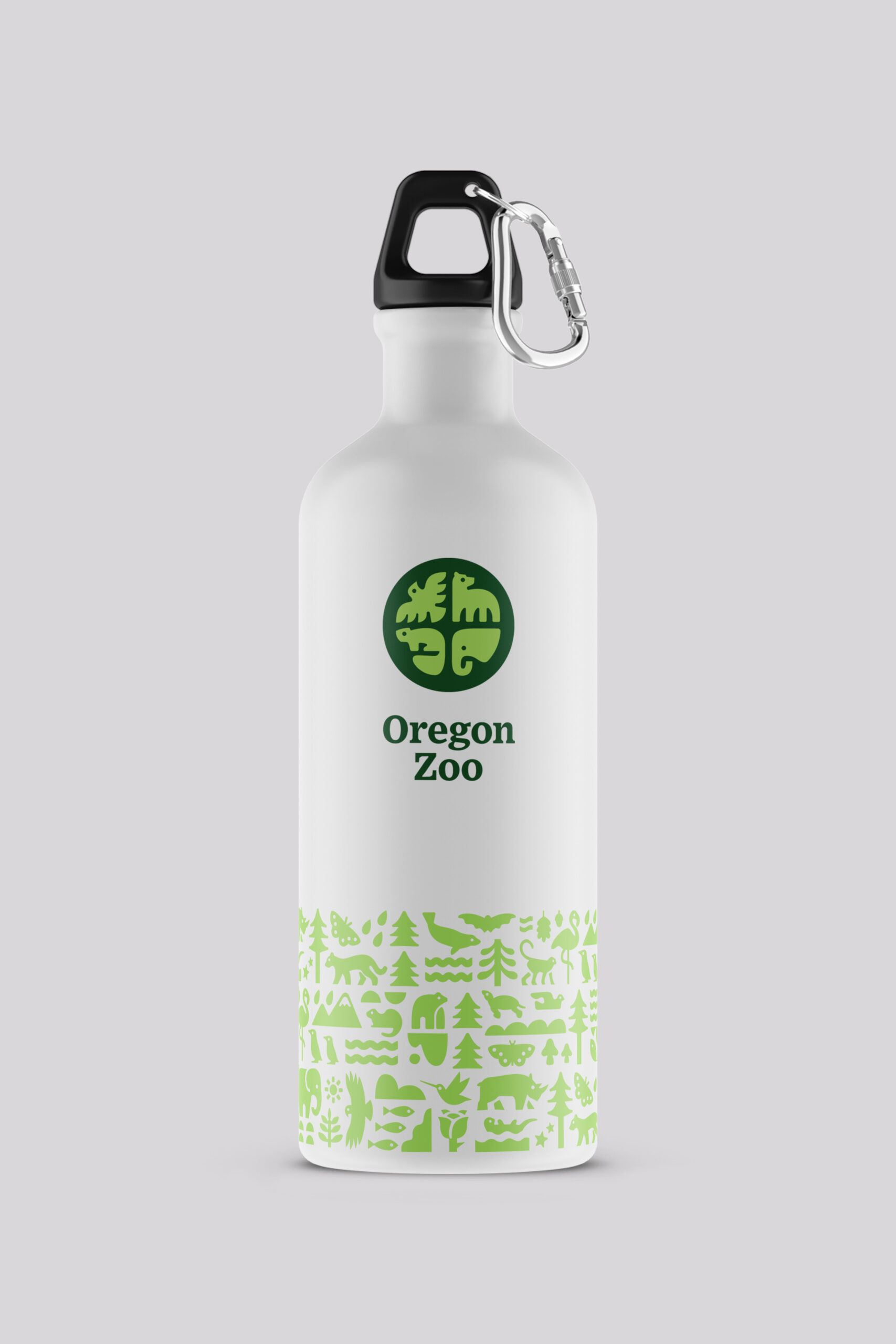
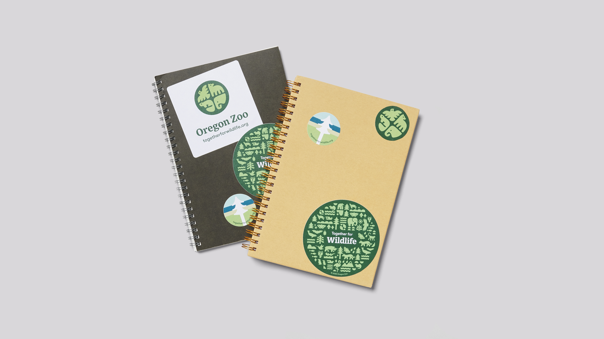
Merchandise Design
Collaborators
Afternoon, Inc
Bureau of Betterment
Rosten Pictures
Studio Chris Bolton
Type Five Studio
A PNW Icon
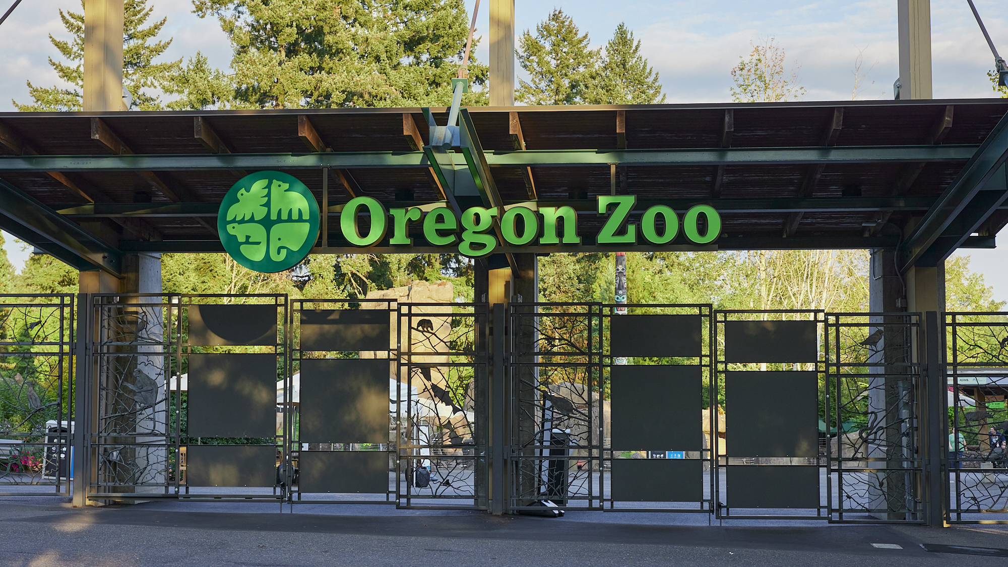
The Oregon Zoo is the oldest zoological park west of the Mississippi and the most popular paid attraction in all of the Pacific Northwest. The Zoo, its residents, and even its location are iconic to the people who call this corner of the country home. As part of Portland’s regional government, Metro (a longtime DAD client), the Zoo is supported by tax-payers, donations and visitors. DAD worked with the Zoo over the course of more than 13 months to create their first all-new identity in over a quarter century.
A Generational Identity
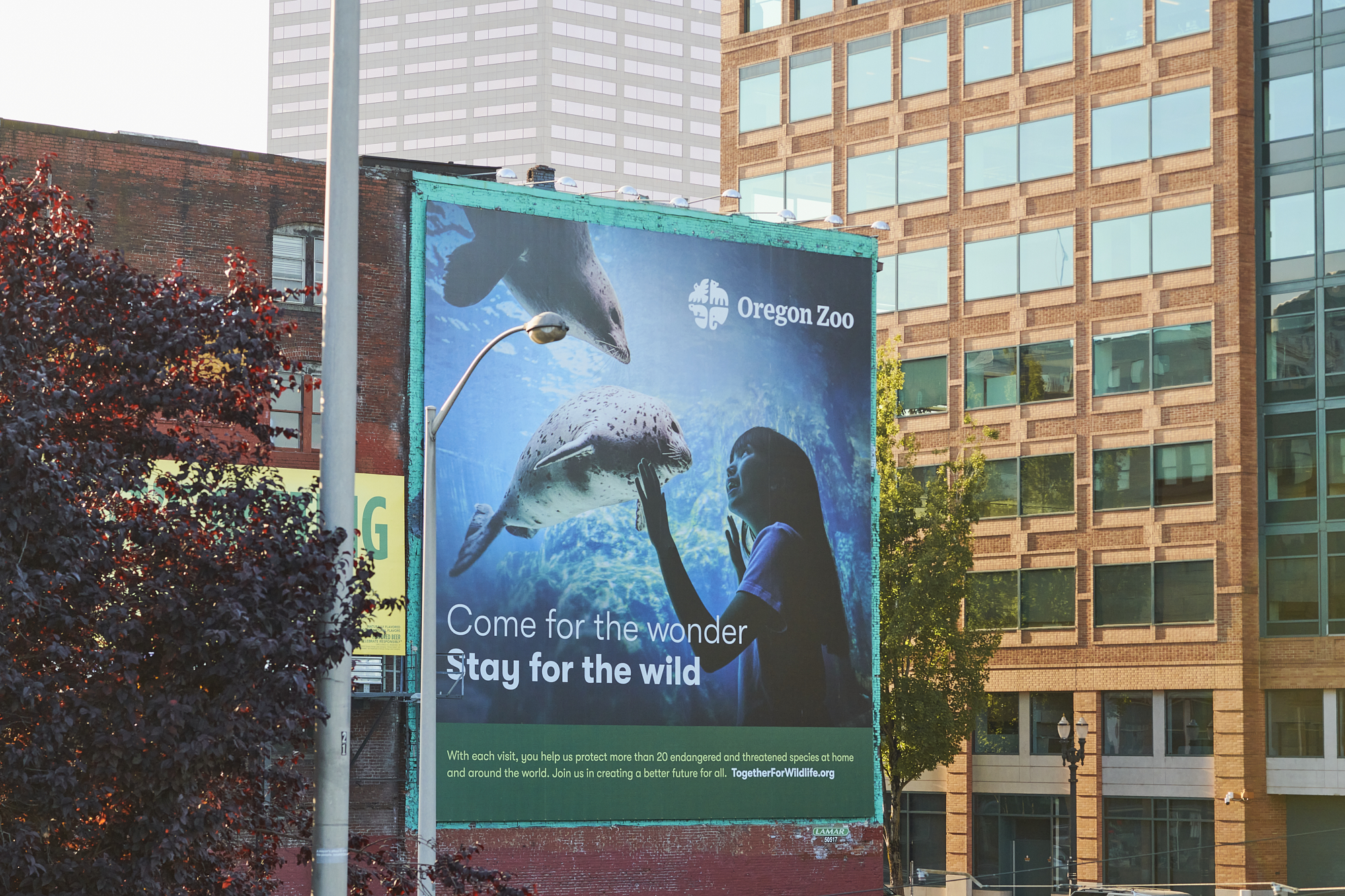
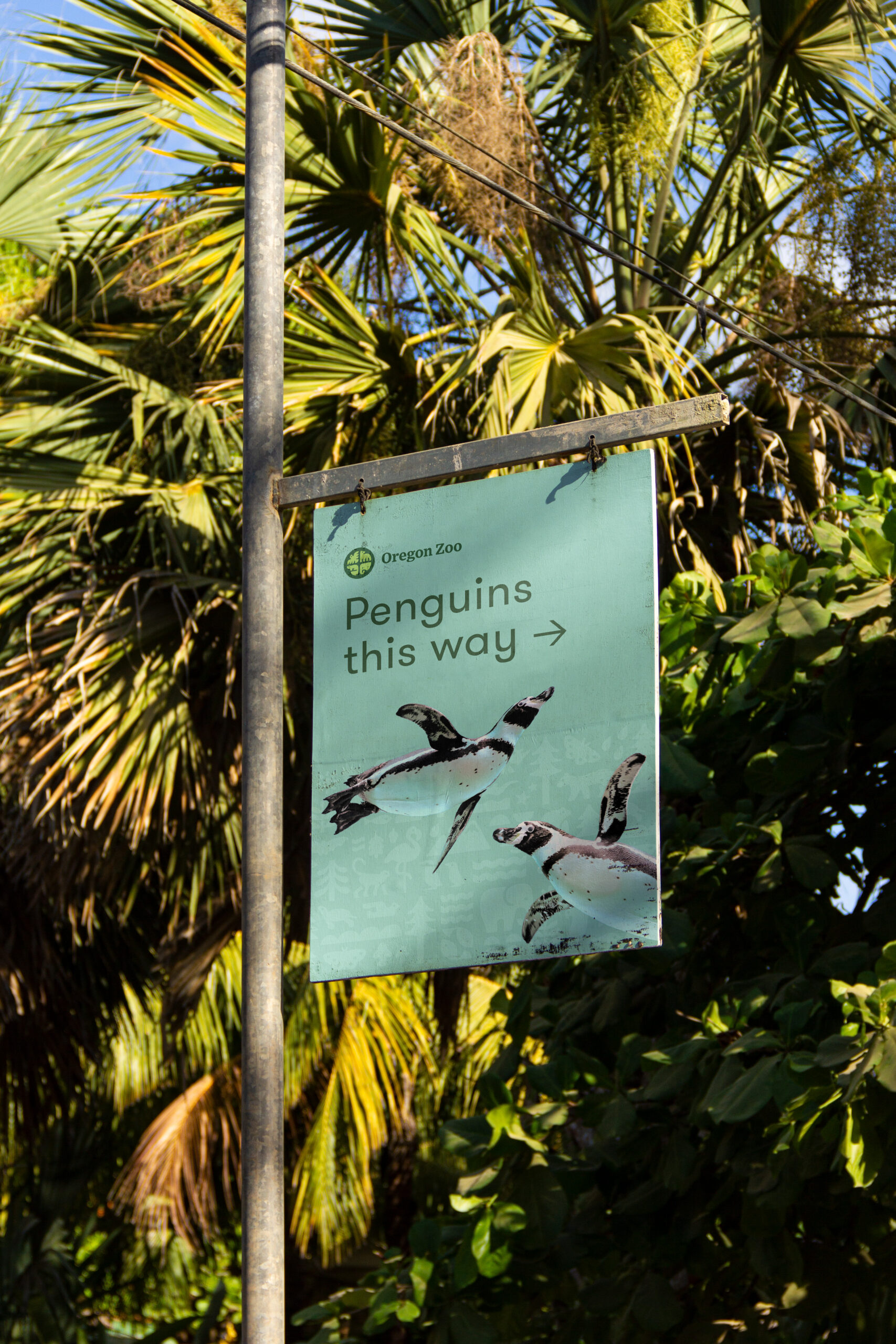
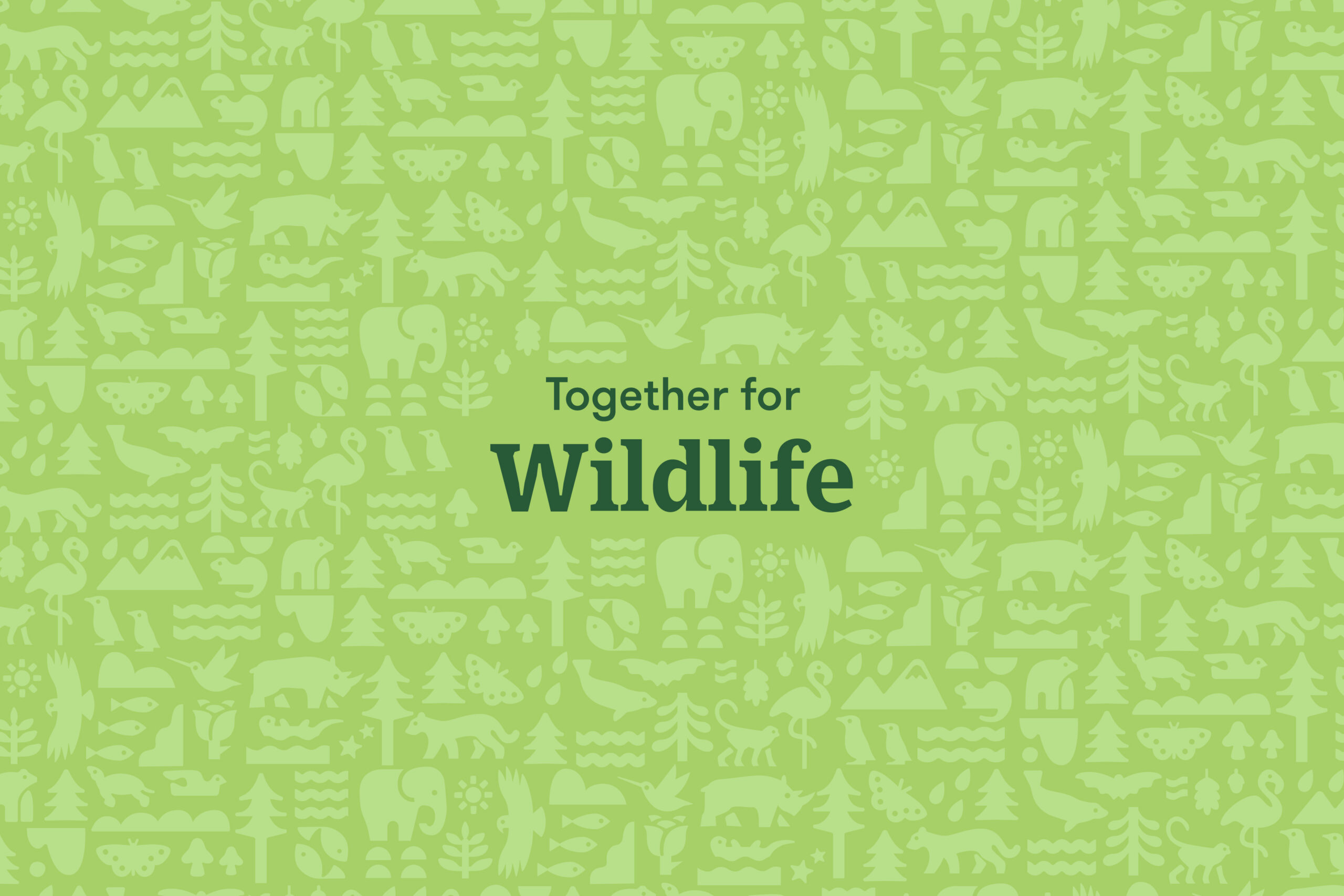
Not only did the brand need to last for a generation, but it also had to work in hundreds of touchpoints and with dozens of branded events hosted by the Zoo. Furthermore, it supported a reimagined conservation-focused mission and vision for the Zoo, embodied by a new tagline “Together for Wildlife.” Following a survey of scores of zoos around the world, DAD worked with the internal marketing team to develop a fitting creative vision for the new identity: it should feel like part of the Northwest, it should inspire pride in the Zoo and it should reflect the diversity of wildlife that calls it home.
Diversity & Flexibility
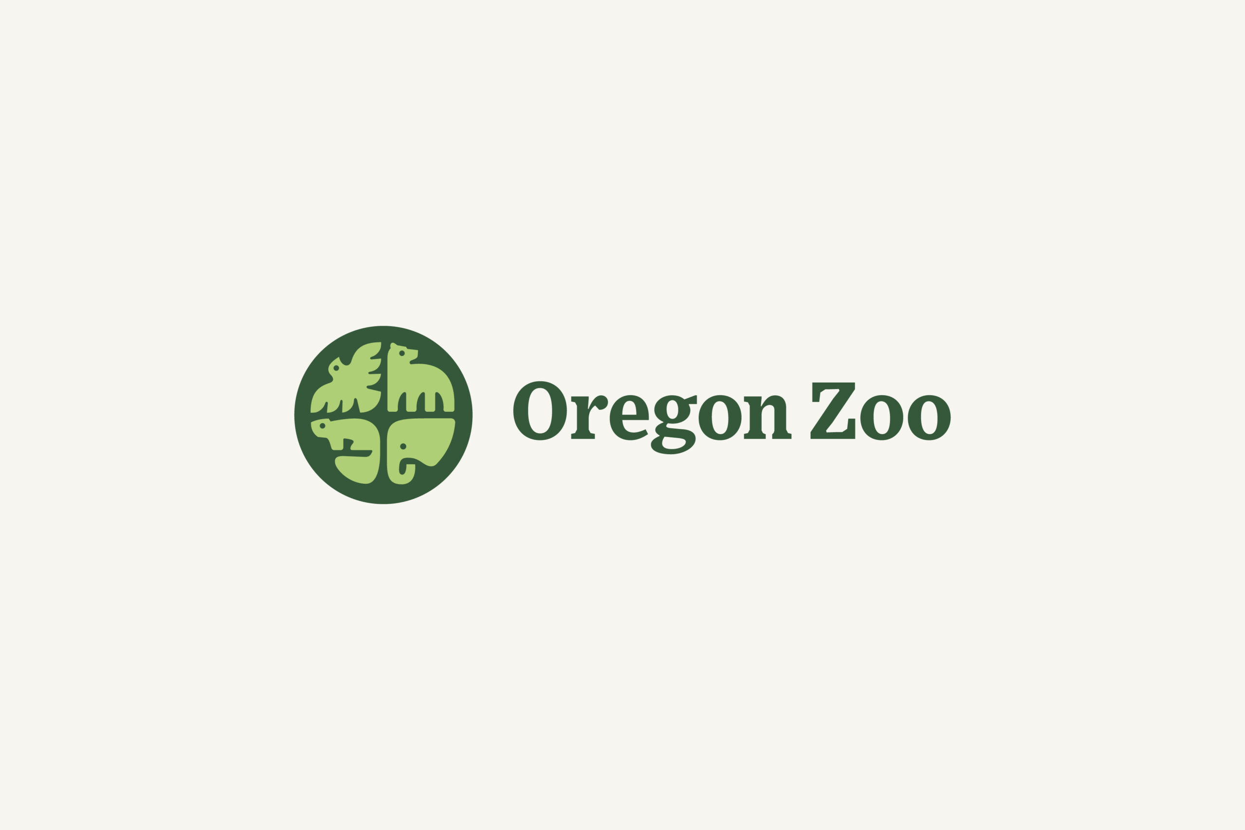
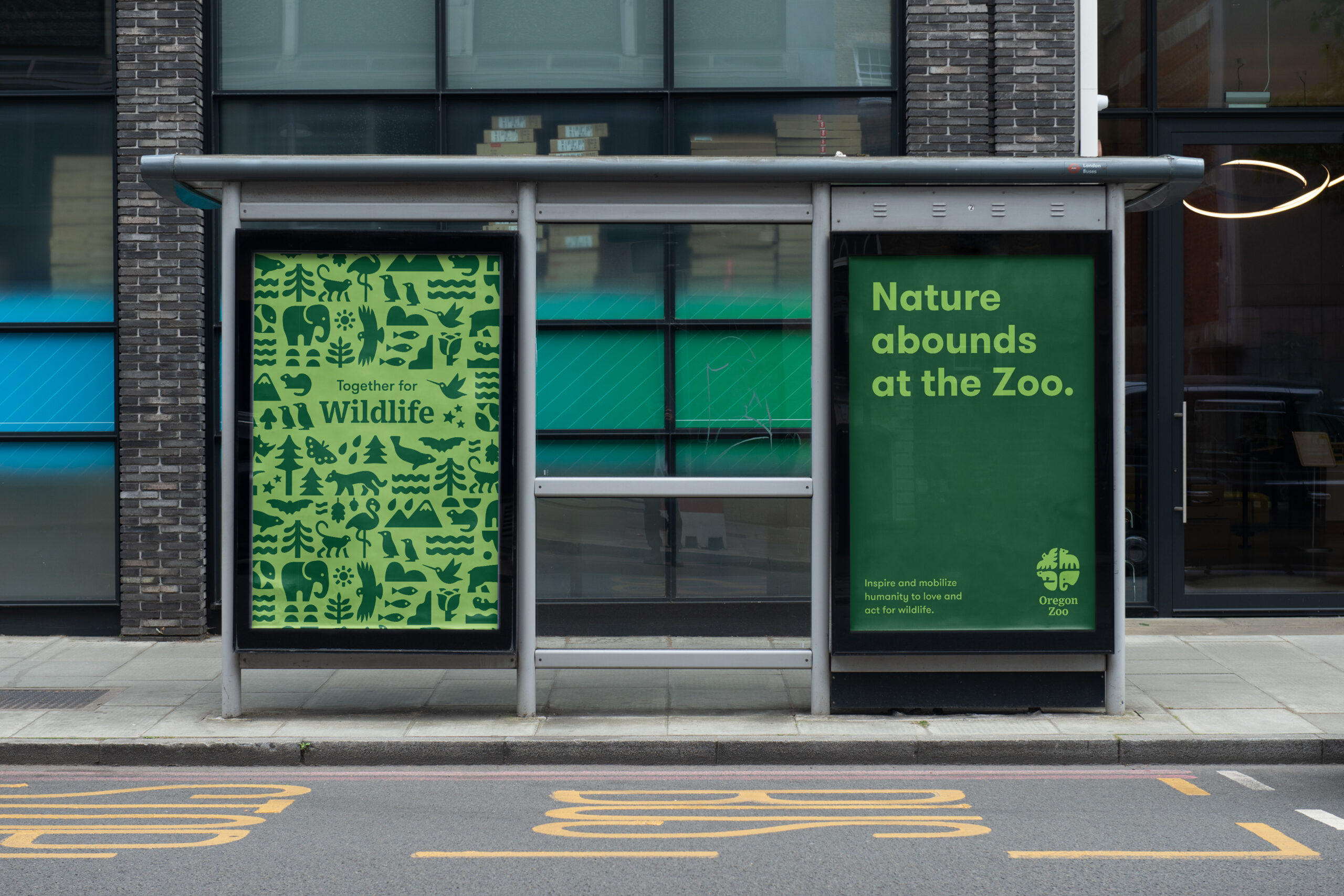
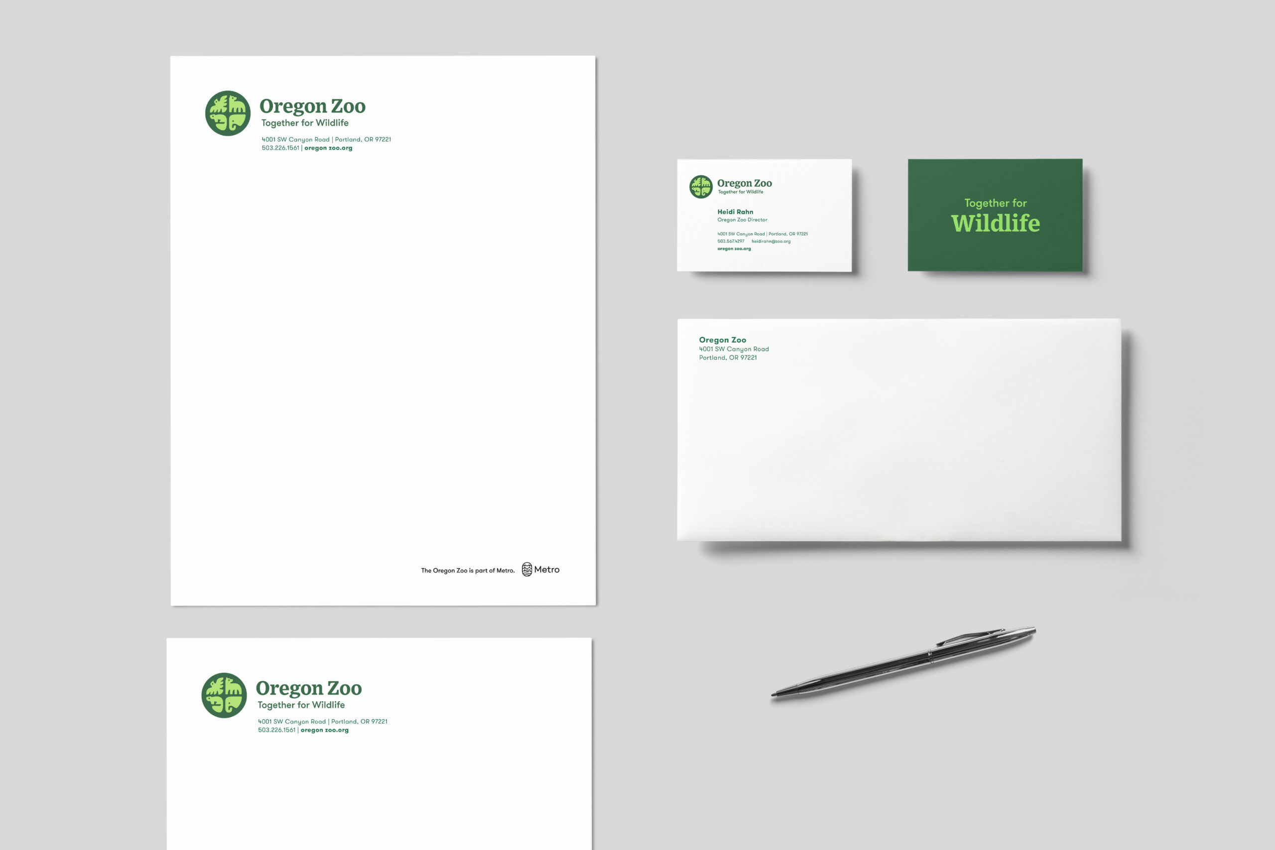
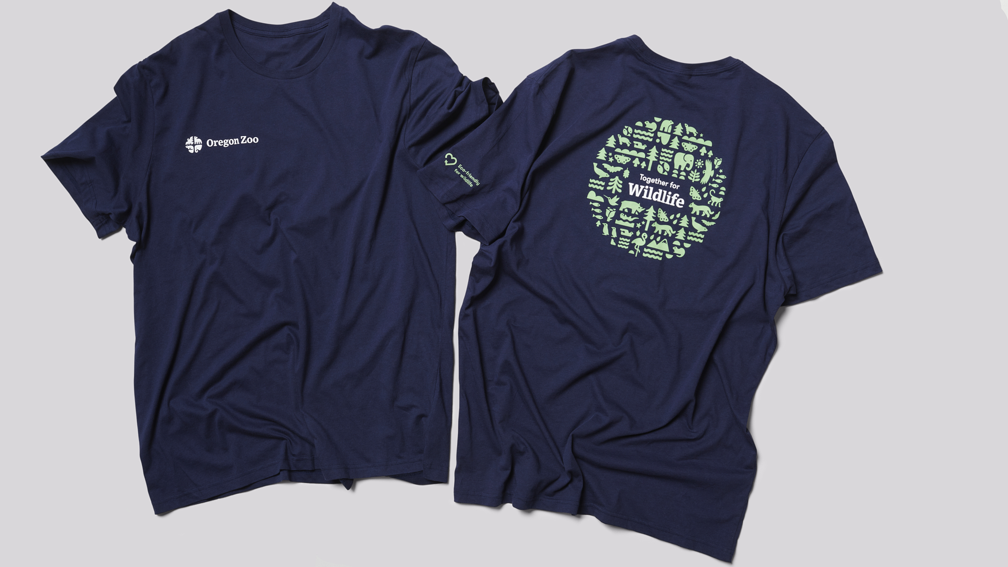
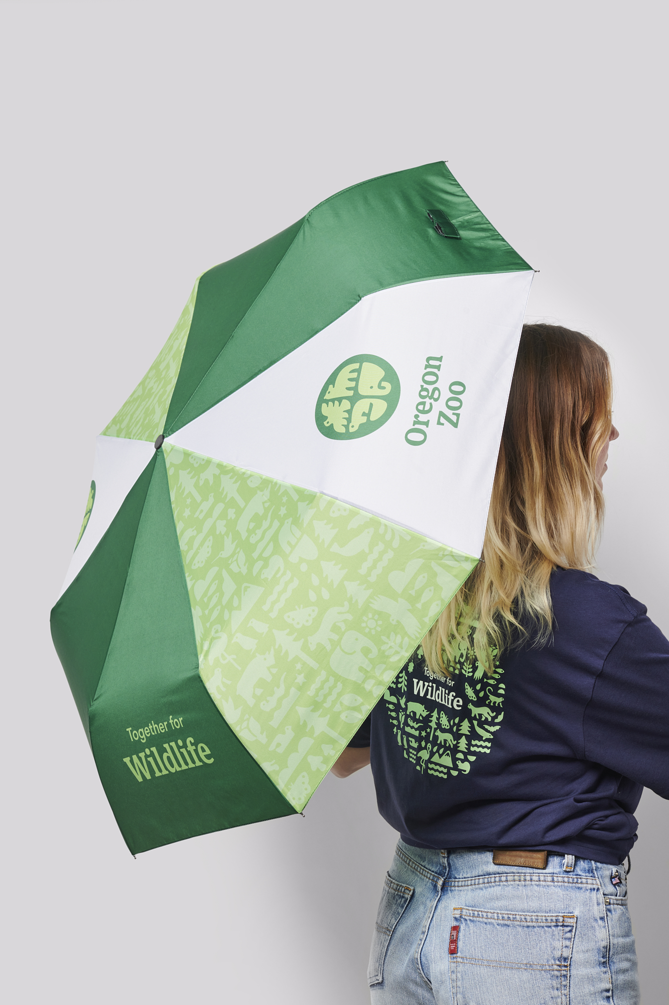
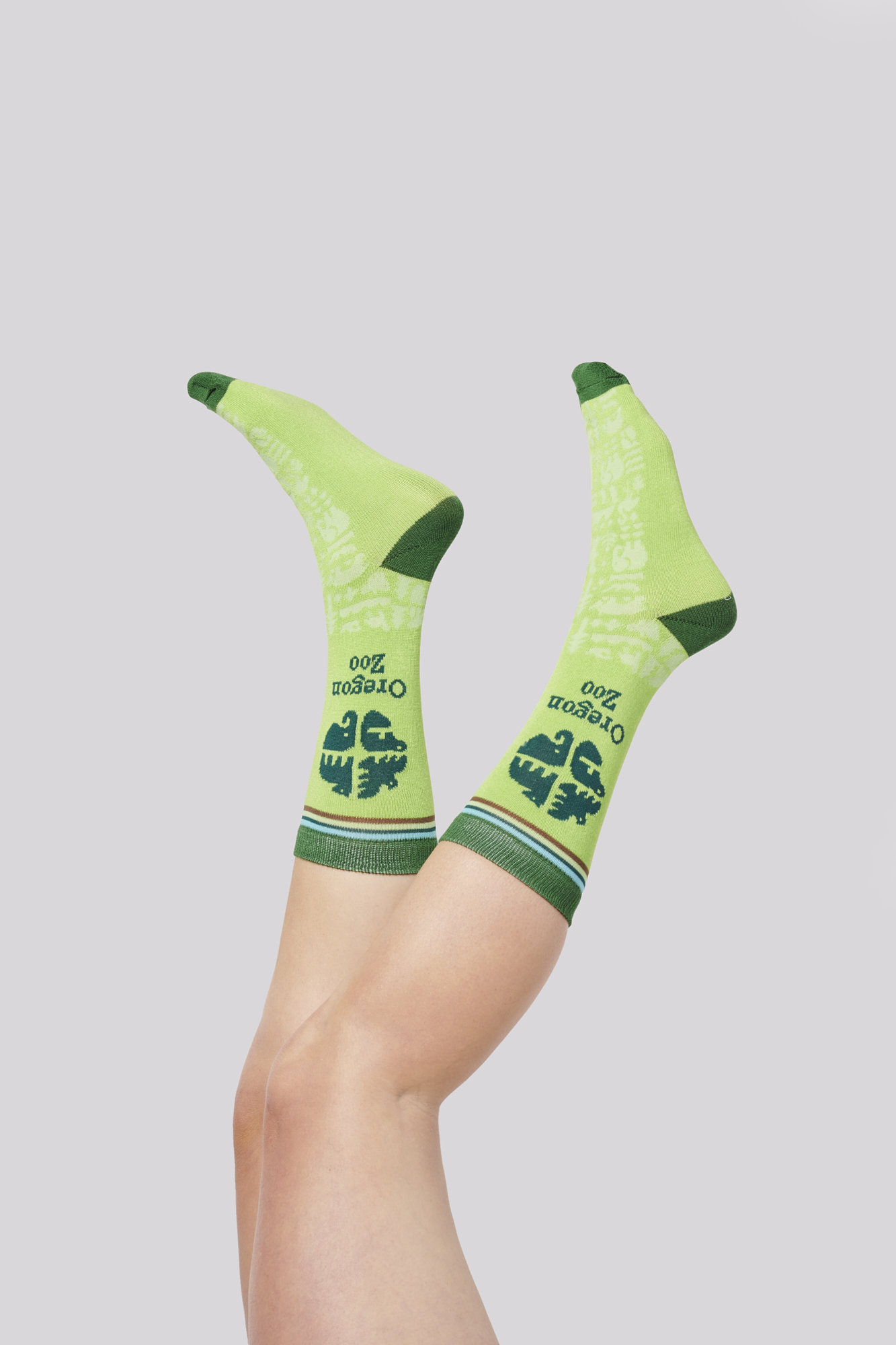
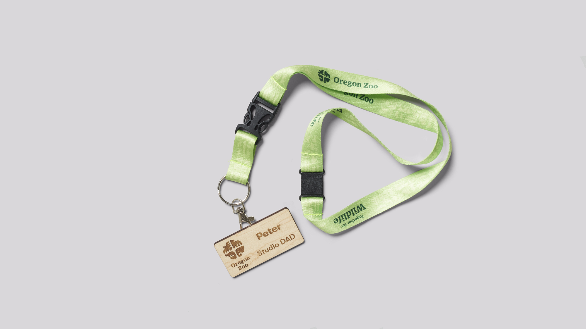
Identity exploration and refinement yielded an approach that was simple, but flexible; something that had a sense of place, but felt timeless; an identity built to last another 25 years. The logomark is built on a circular container shape, referencing the “O” in Oregon, and features animals iconic not only to the Zoo, but to the Northwest. A scalable patterned icon system represents the diversity found at the zoo while celebrating the flora and fauna of the region. The system developed by DAD included a revised brand architecture with accommodations made for multiple sub-brands and promotions, the Oregon Zoo Foundations (the Zoo’s fundraising arm), and their parent organization, Metro.
With a massive following on multiple social platforms, the Zoo was in a unique position to make a huge splash with the rollout of the new brand solely through owned media. DAD was given the opportunity to create a video that didn’t so much celebrate the launch of a new identity, but serve to propel a movement in wildlife conservation. It’s the Zoo everyone knows and loves, just with a renewed vision for the future.
