TOC
Client
TOC Concert Hall
Industry
Performing Arts
Disciplines
Brand Identity
Naming
Since 1882
As the name implies, the Old Church is a historic house of worship in Portland, Oregon’s Cultural District. The structure is built in the Victorian Gothic Carpenter style—a rarity for Portland—and just one reason it’s on the National Register of Historic Places.
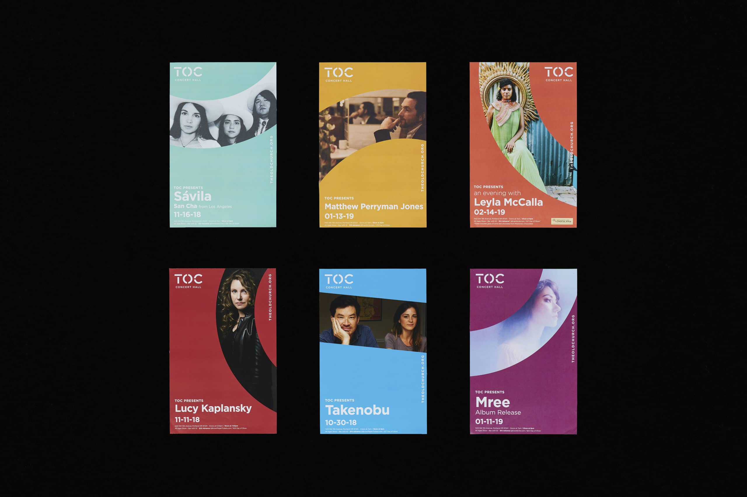
Since 1967, The Old Church has been a concert venue that primarily features classical and heritage styles of music. But to stay relevant, everyone needs to change and grow. The Old Church began evolving its programming. While they’re keen to keep their core audience engaged with jazz and classical music, they now draw a more diverse audience with modern music from national touring acts, as well as live storytelling and film events. Their visual identity needed to evolve to match.
Locally Loved and Nationally Appreciated
Studio DAD was brought in to help reimagine how The Old Church presented itself to the world. They wanted to shift from being seen as a local venue to a national destination. Or as The Old Church’s Executive Director said it “we want to be the Ryman of the Northwest.”
No small feat. Luckily the venue’s 12-person governing board was full of smart, progressive-minded people who all saw the opportunity in making a change. (Which is also no small feat.)
Victorian to Vibrant
On this project, DAD knew the key to success was a collaborative process with The Old Church’s board. Every discussion and presentation was scheduled around board meetings—and each session included active participation by all attendees. This ensured more interesting meetings and collective ownership and affinity for where we ended up.
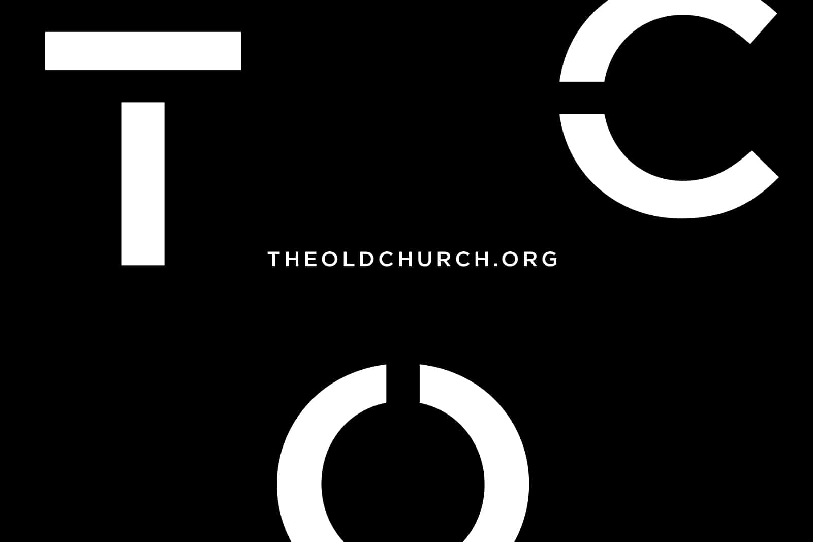
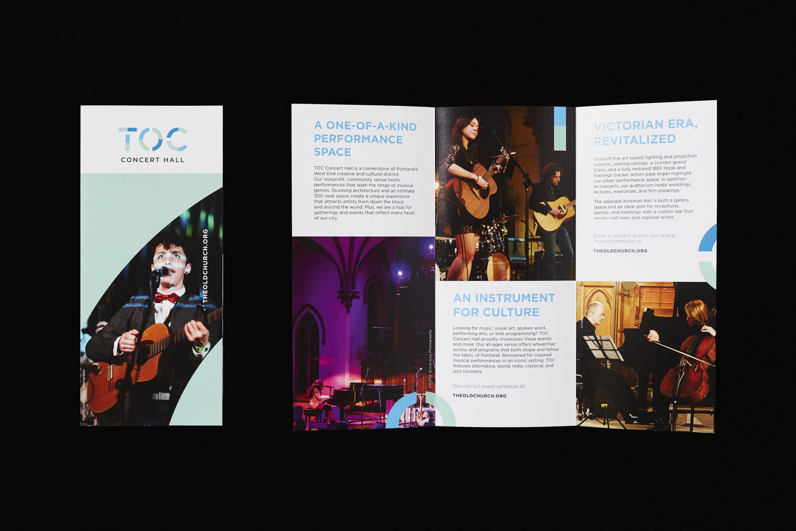
The Old Church’s existing identity played off the venue’s architecture. And the structure is stunning—but DAD envisioned a more conceptual approach. Specifically, taking simple geometric shapes present in the building’s design and using them to construct the logomark.
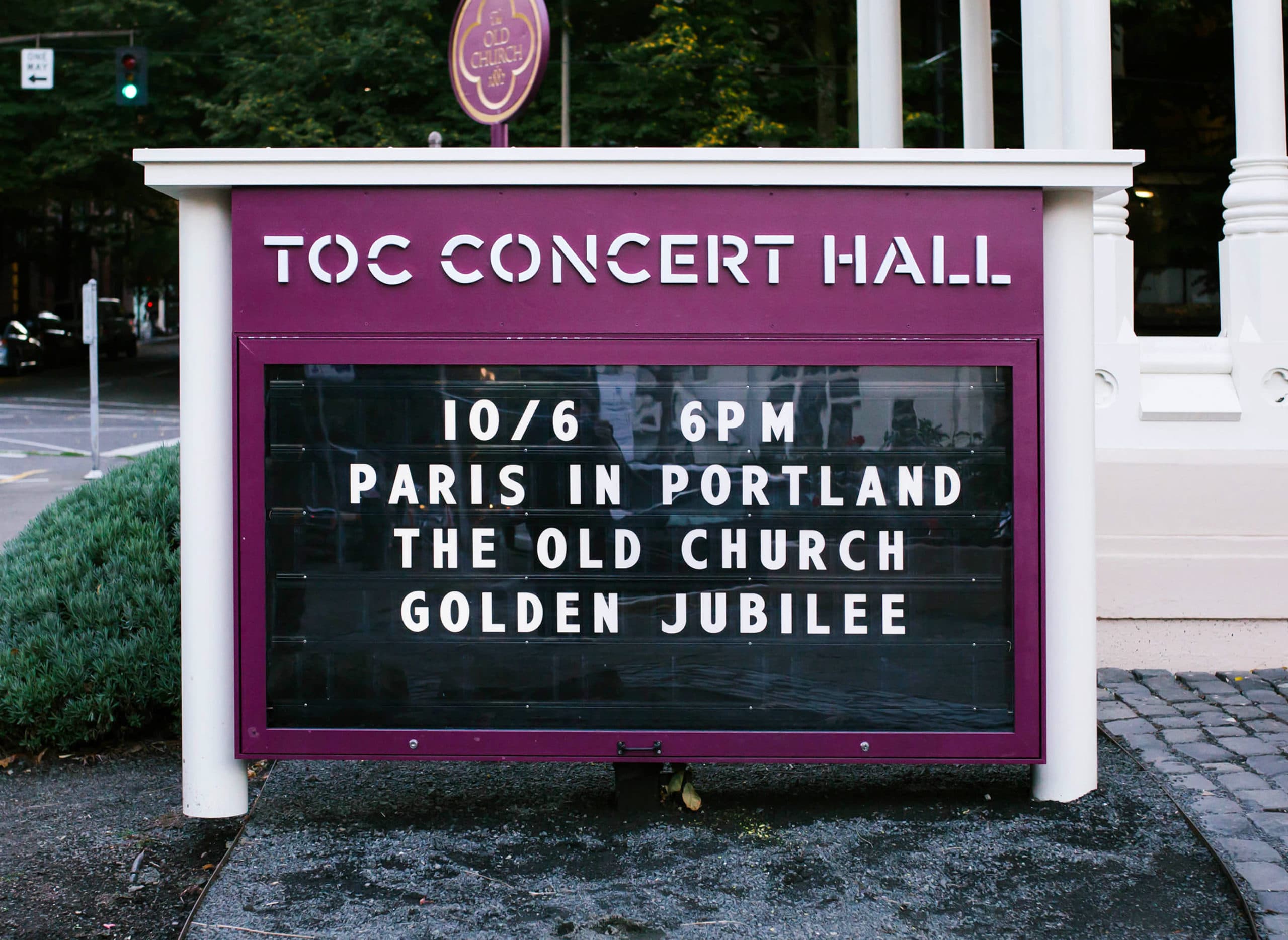
Yet, there was a simultaneous hurdle. Naming is an endlessly sensitive subject. Love it, hate it, keep it, change it, “I don’t know”—there are always stakeholders on every side of the discussion. It was quite a surprise, then, to hear near-universal approval when Tess and Peter suggested changing the name from “The Old Church” to simply “TOC.” Though, to be fair, there was precedent. Throughout the project, Tess and Peter had heard the abbreviation used constantly. If it was a mouthful for the organization itself, it just made sense to own it publicly.
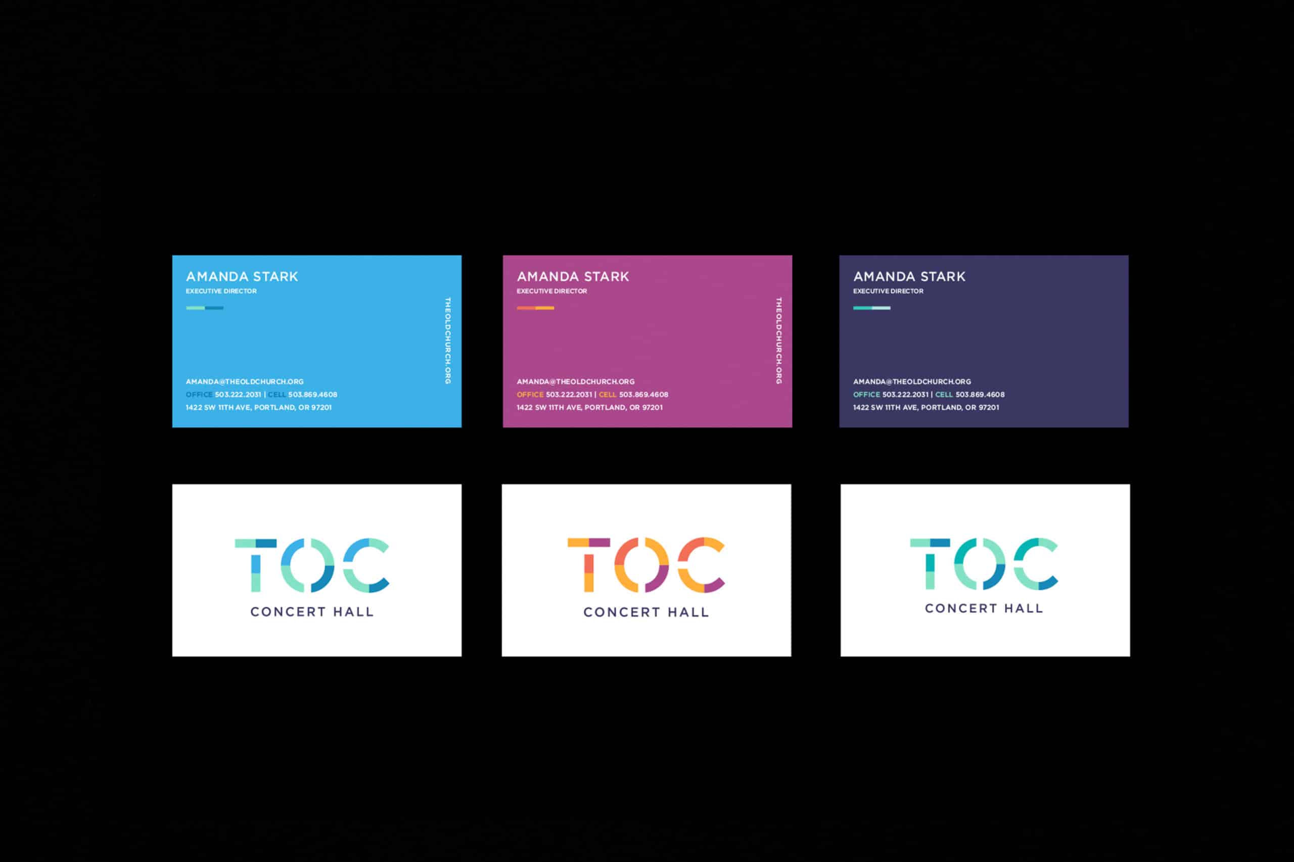
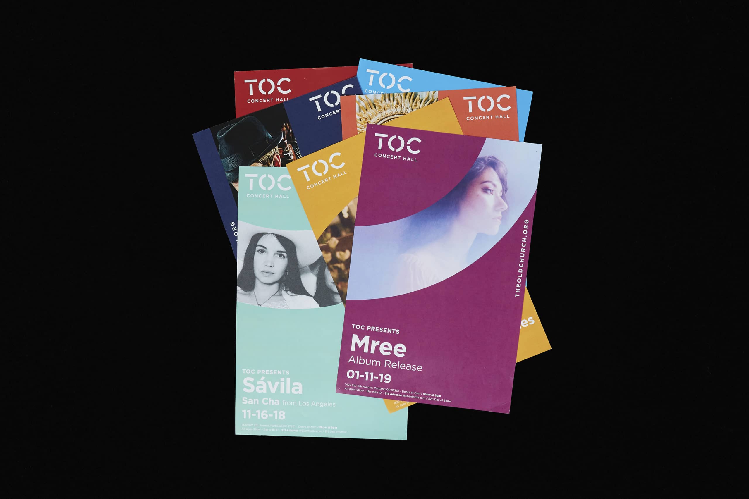
Tess’s design process led to a minimal, yet colorful expression of the new name. Expanding on the logo’s geometric shapes, she took inspiration from the widespread stained glass in the building, inserting negative space into the mark and applying color. The exploration led to a palette that provided multiple logo versions and created room for use in the realm of messaging hierarchy.
The new name and visual identity were unveiled at TOC’s 50th anniversary celebration. True to Studio DAD form, there were baked goods sporting the logo, and the venue is ready for its next century of amazing shows.
